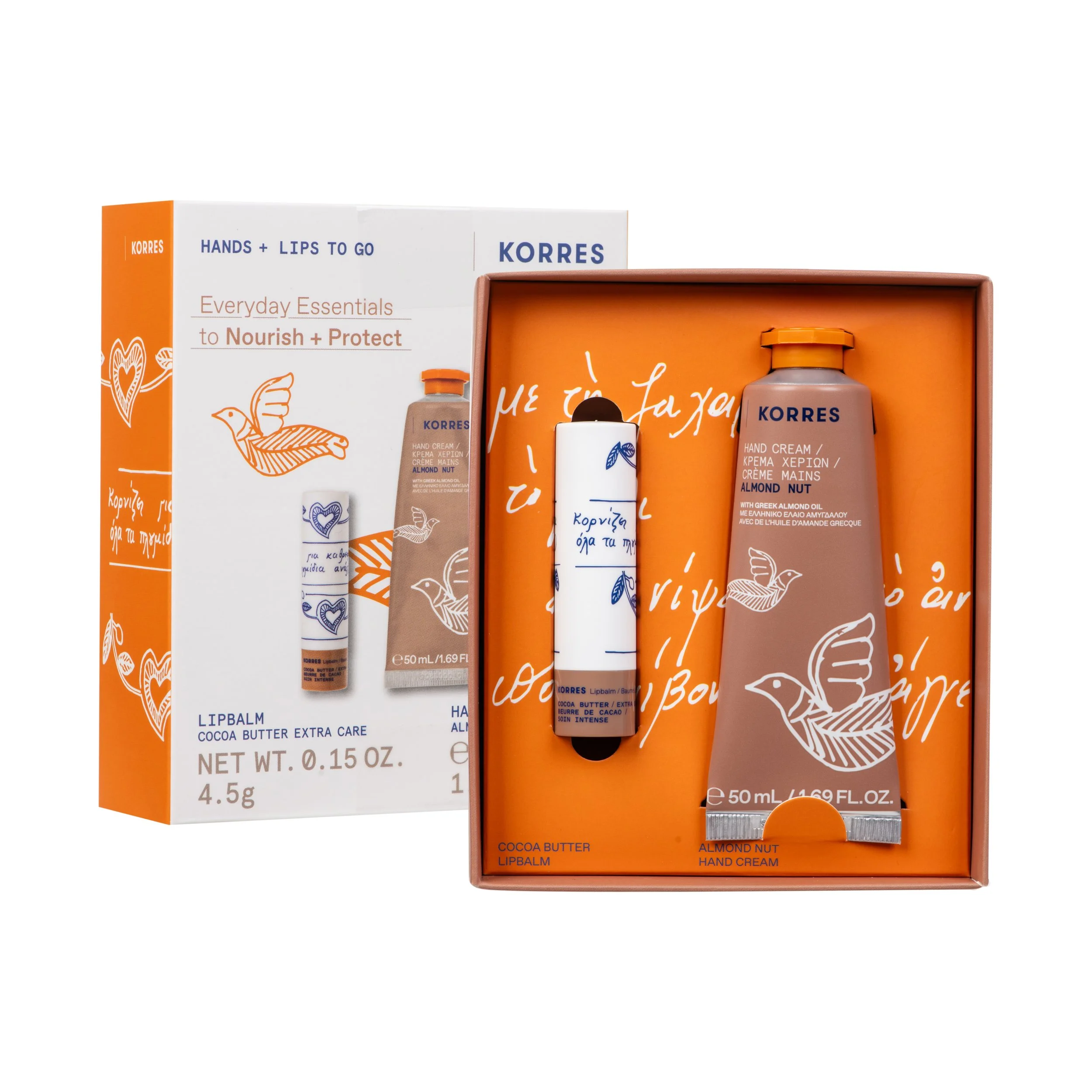
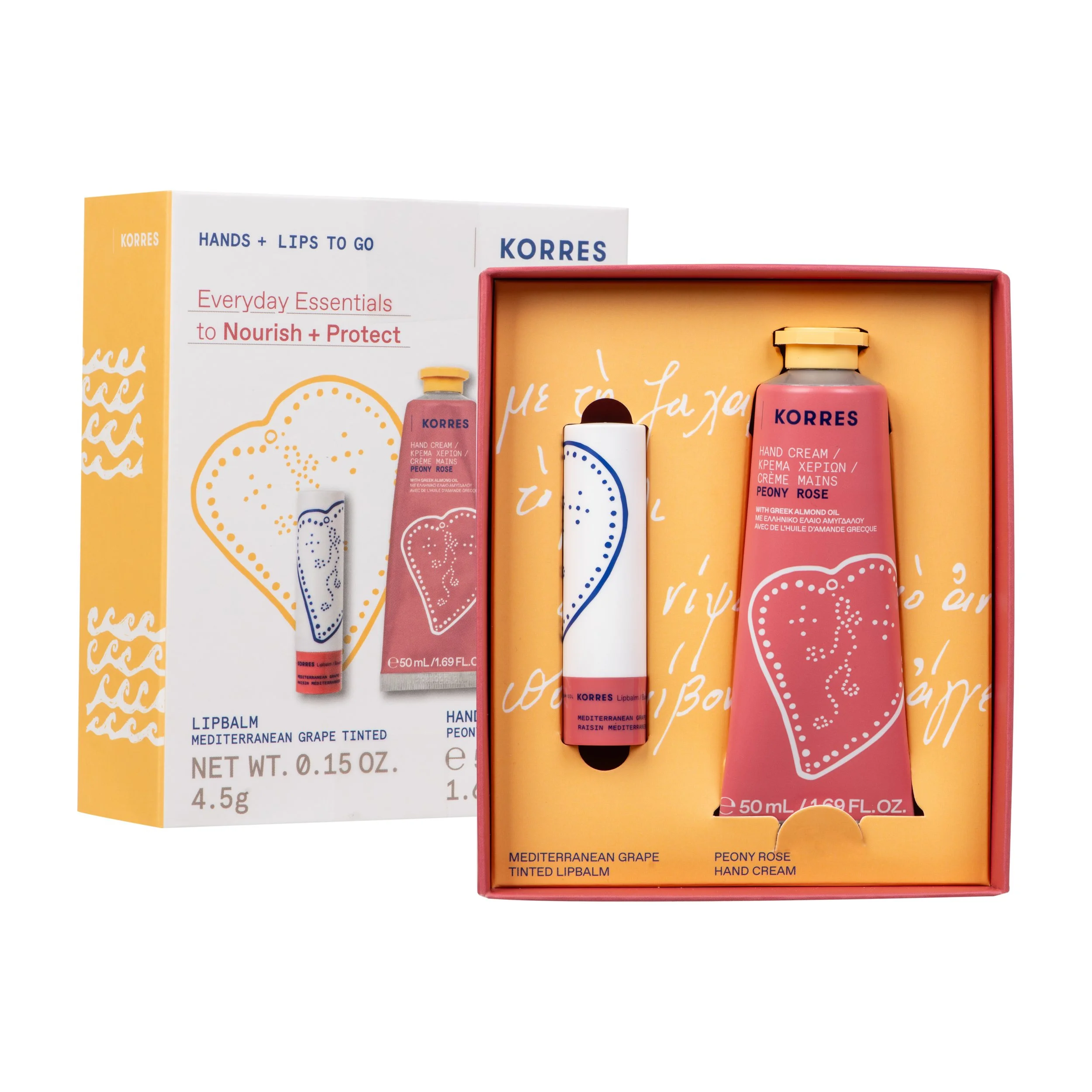
HANDS TO GO
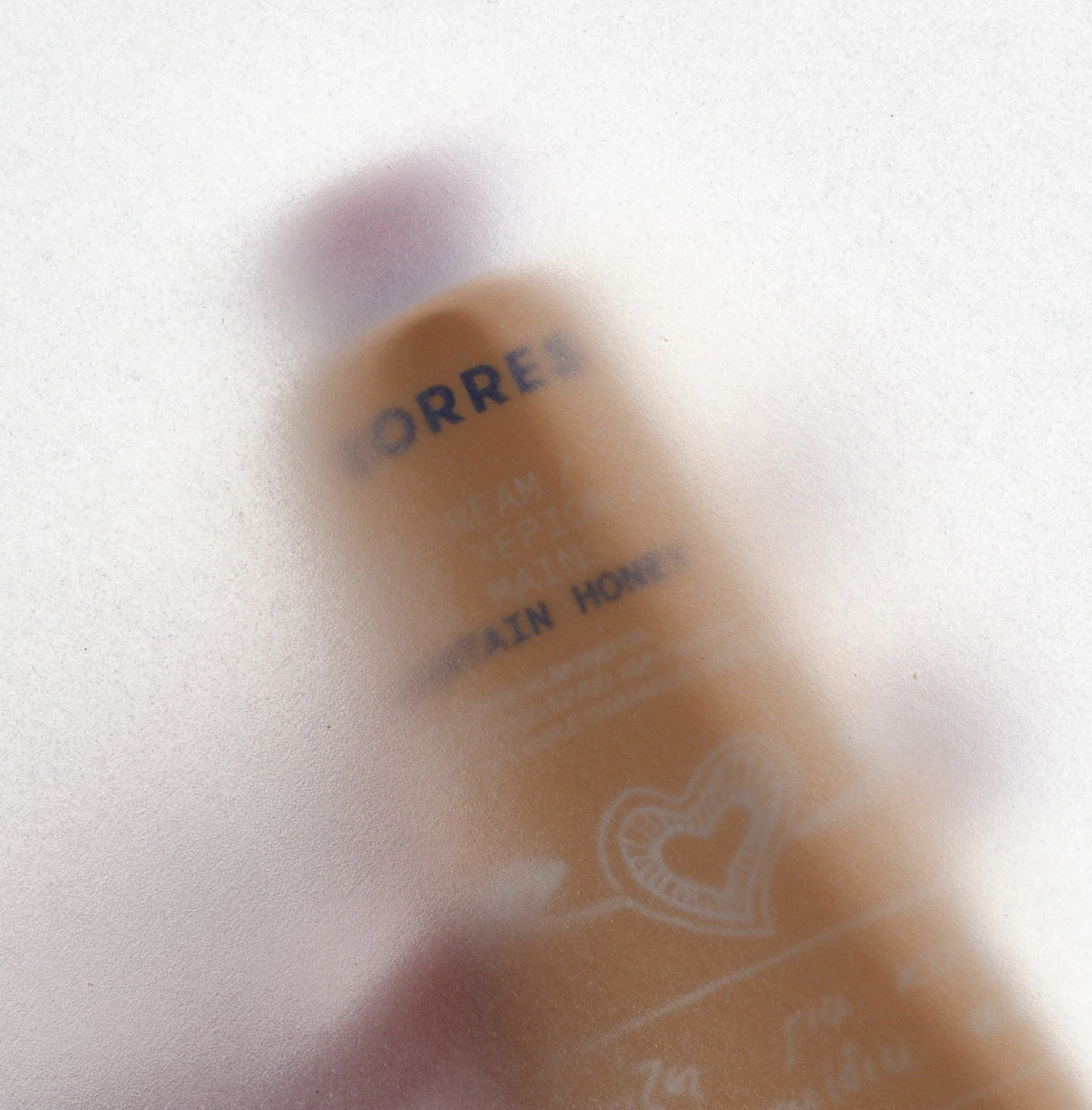
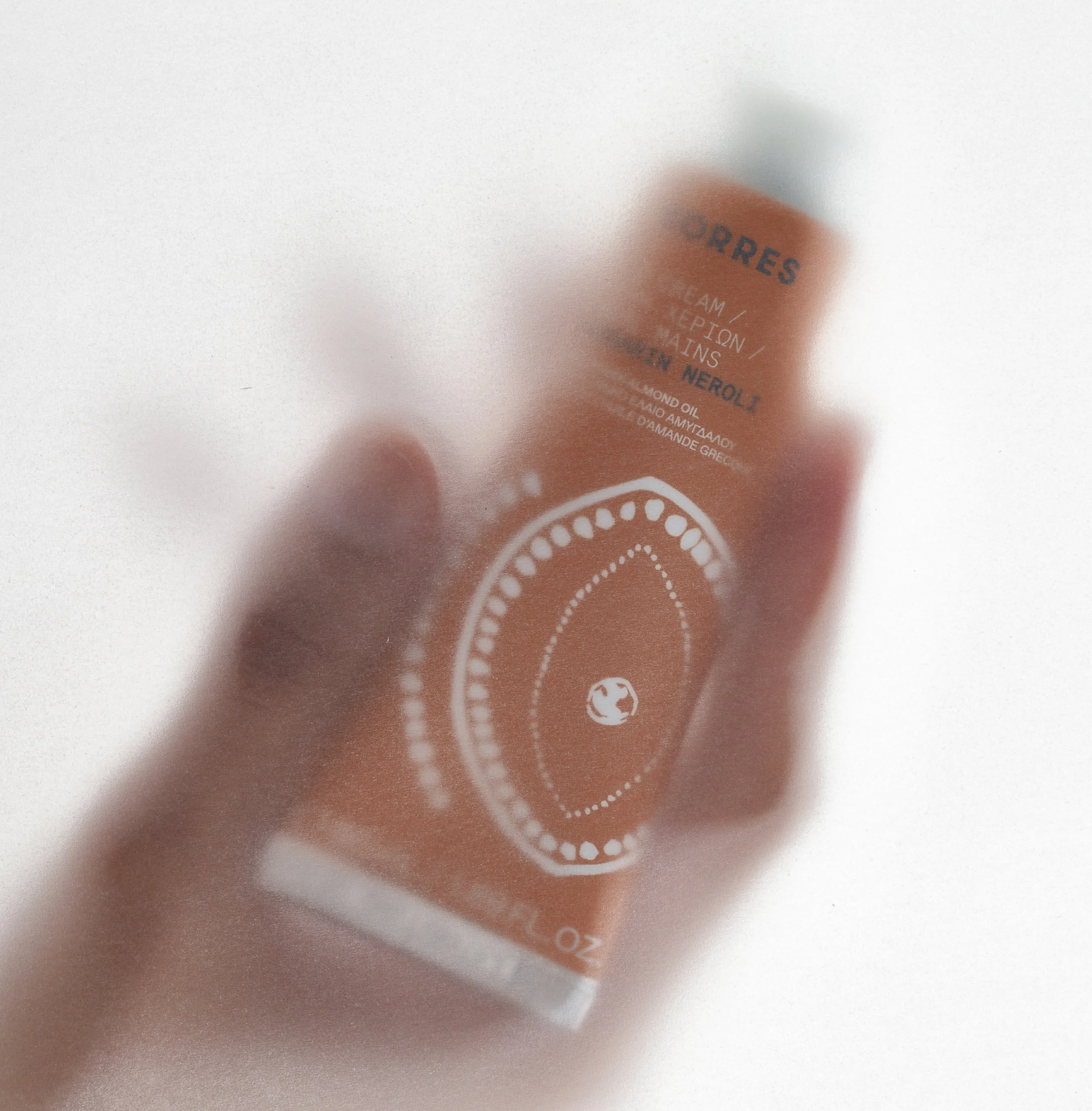
Packaging Design for the Relaunch of KORRES Hand Creams
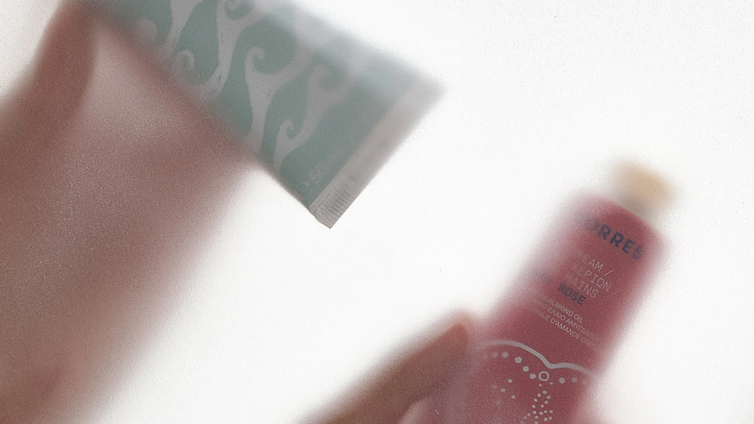
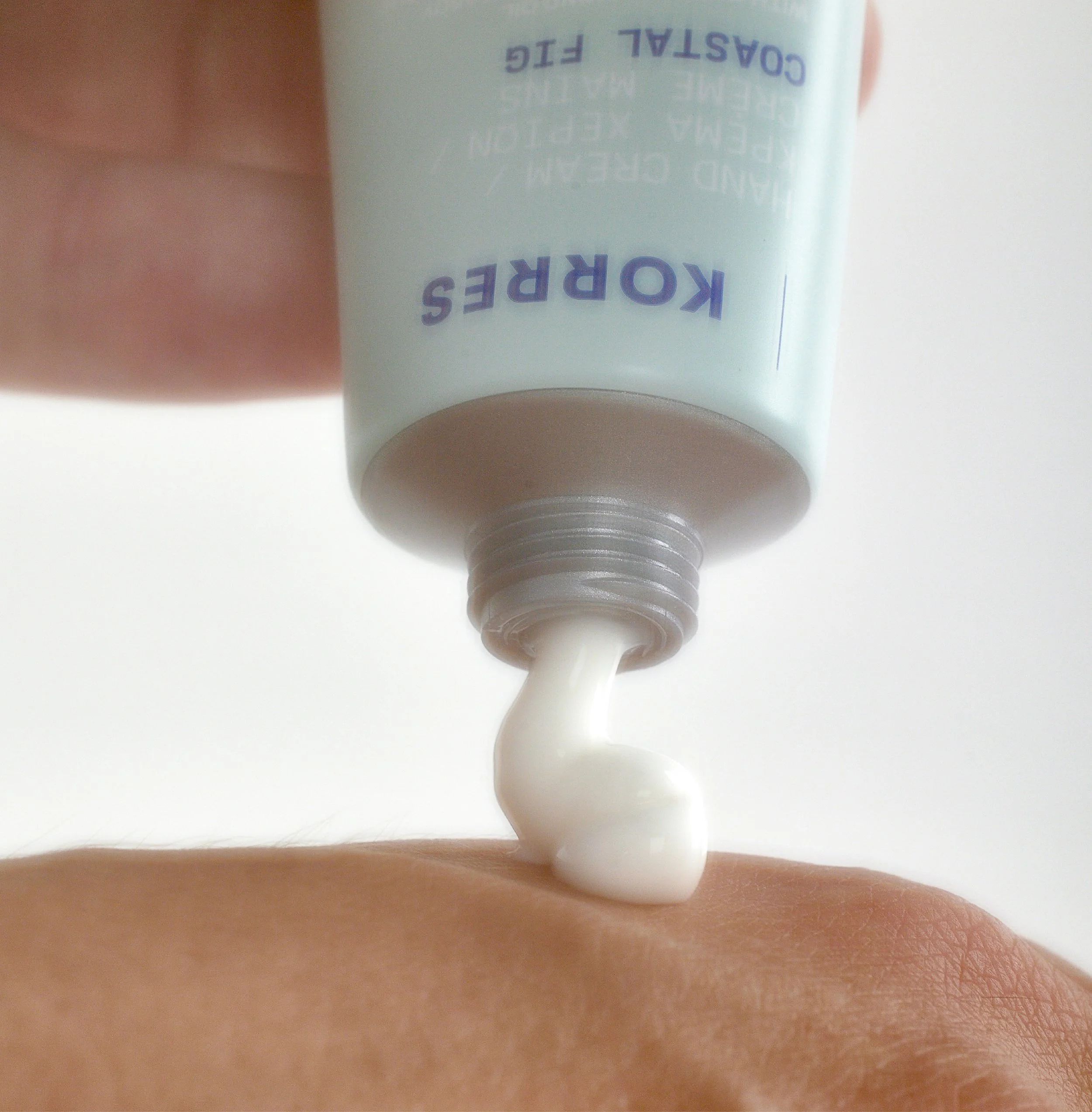
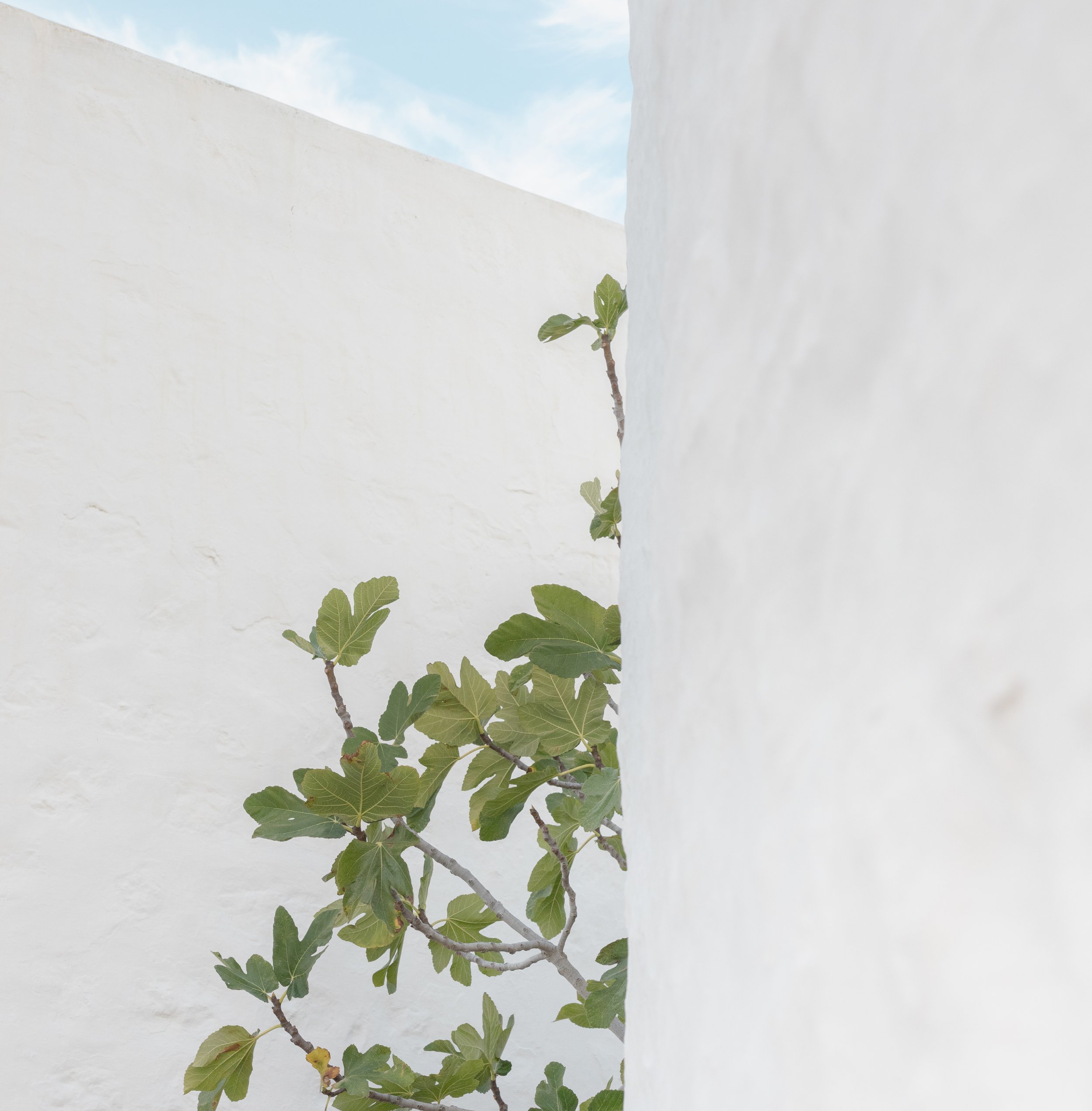
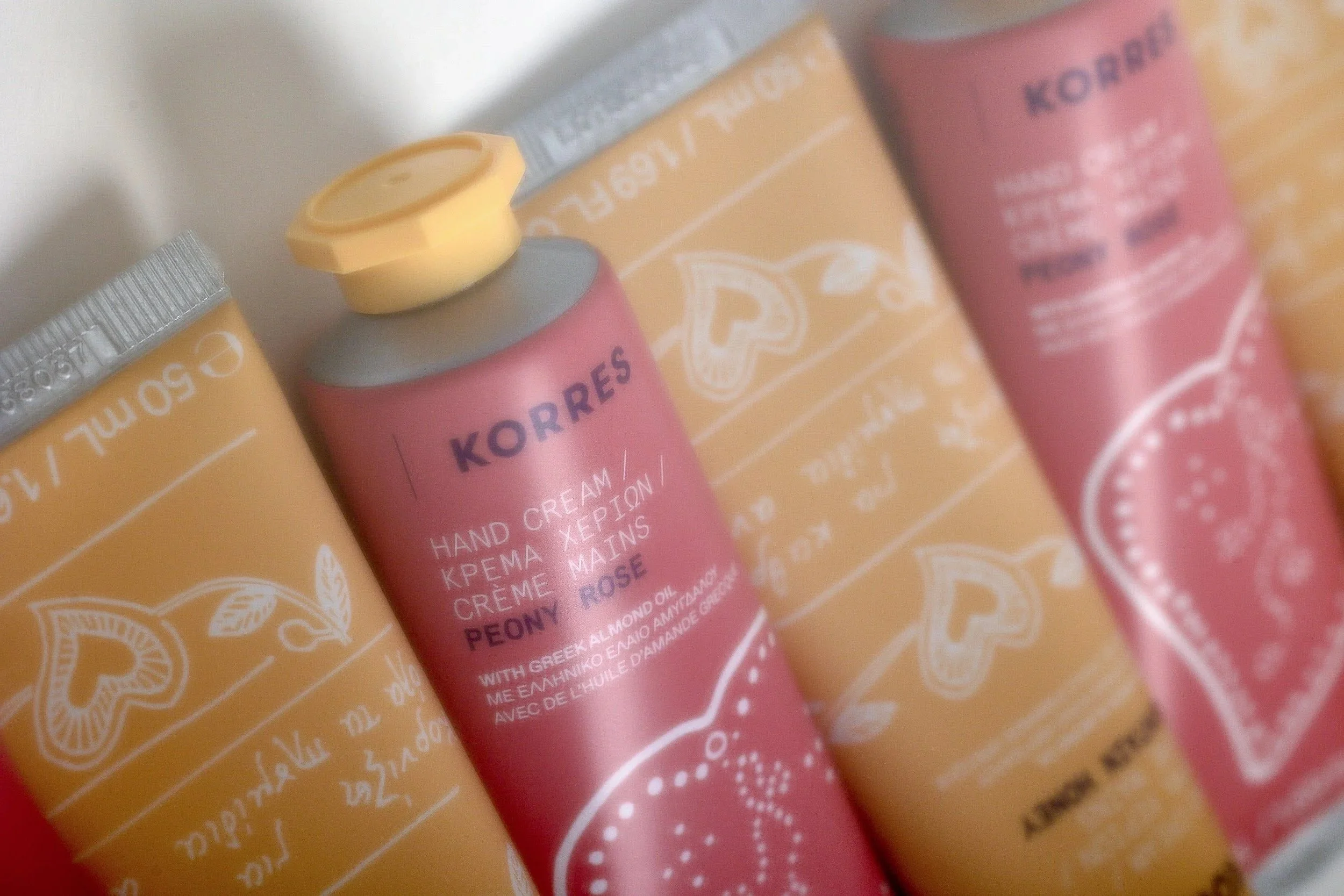
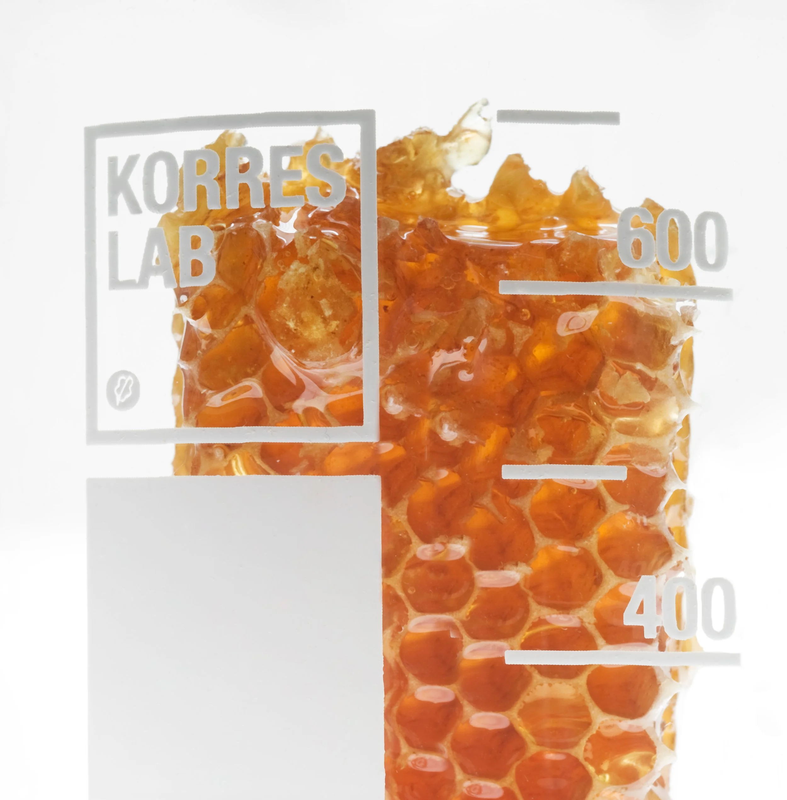
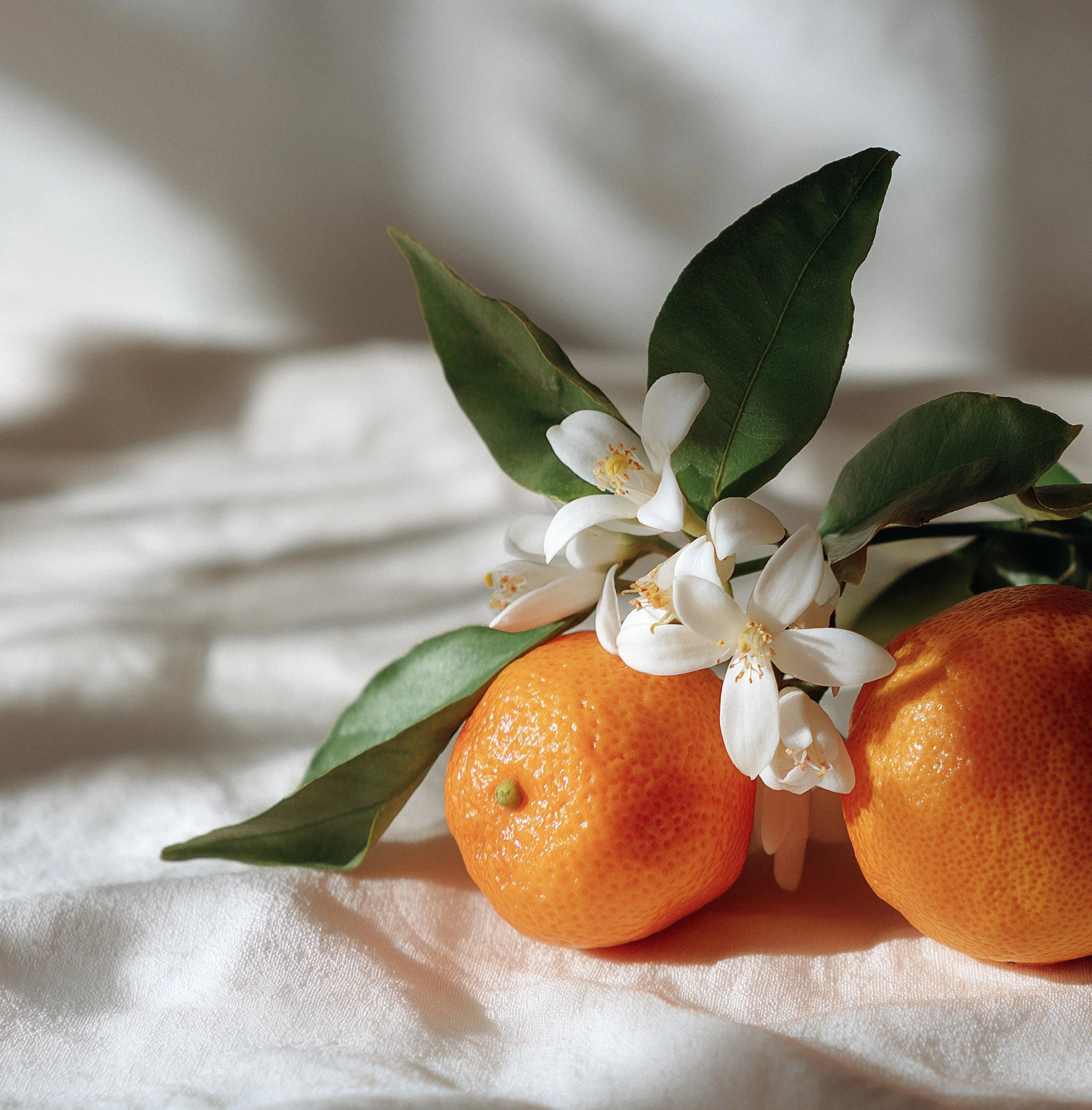
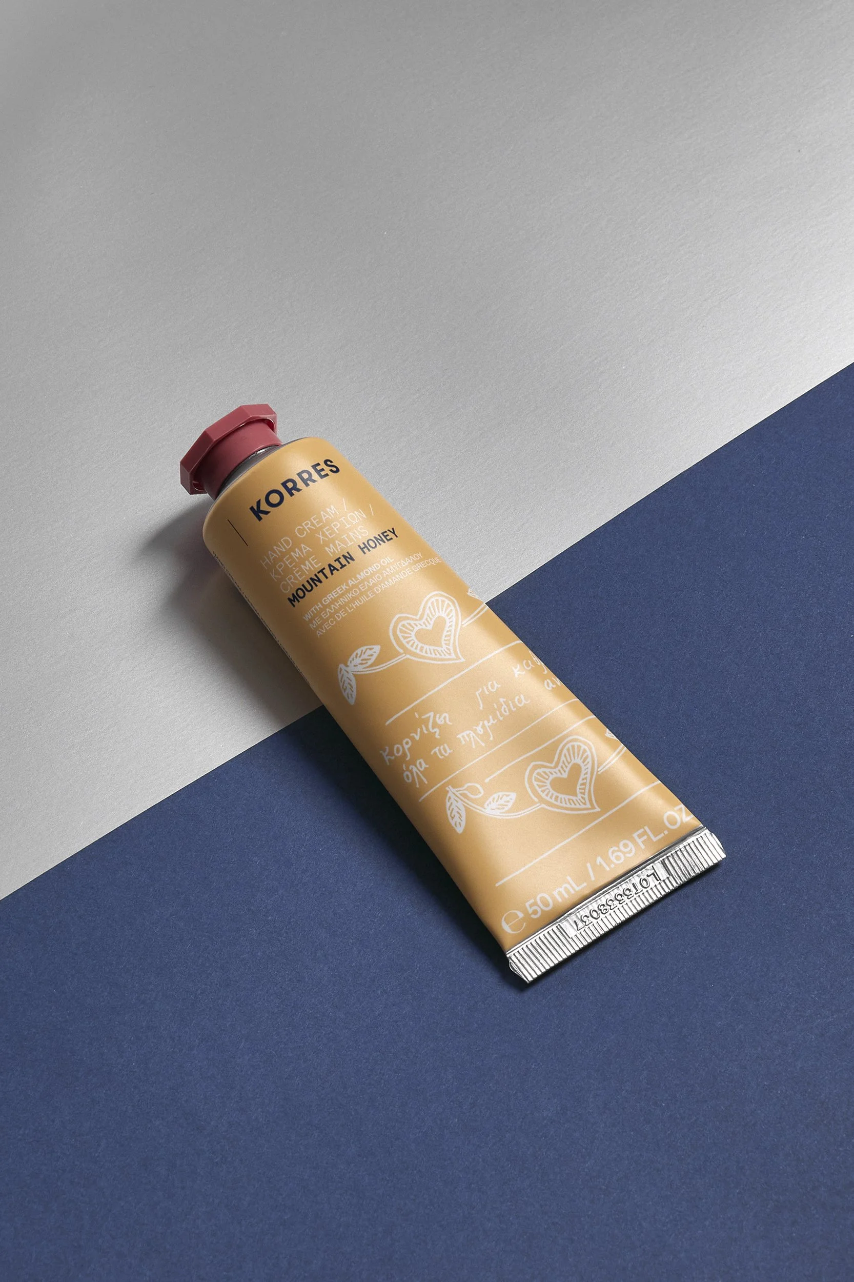
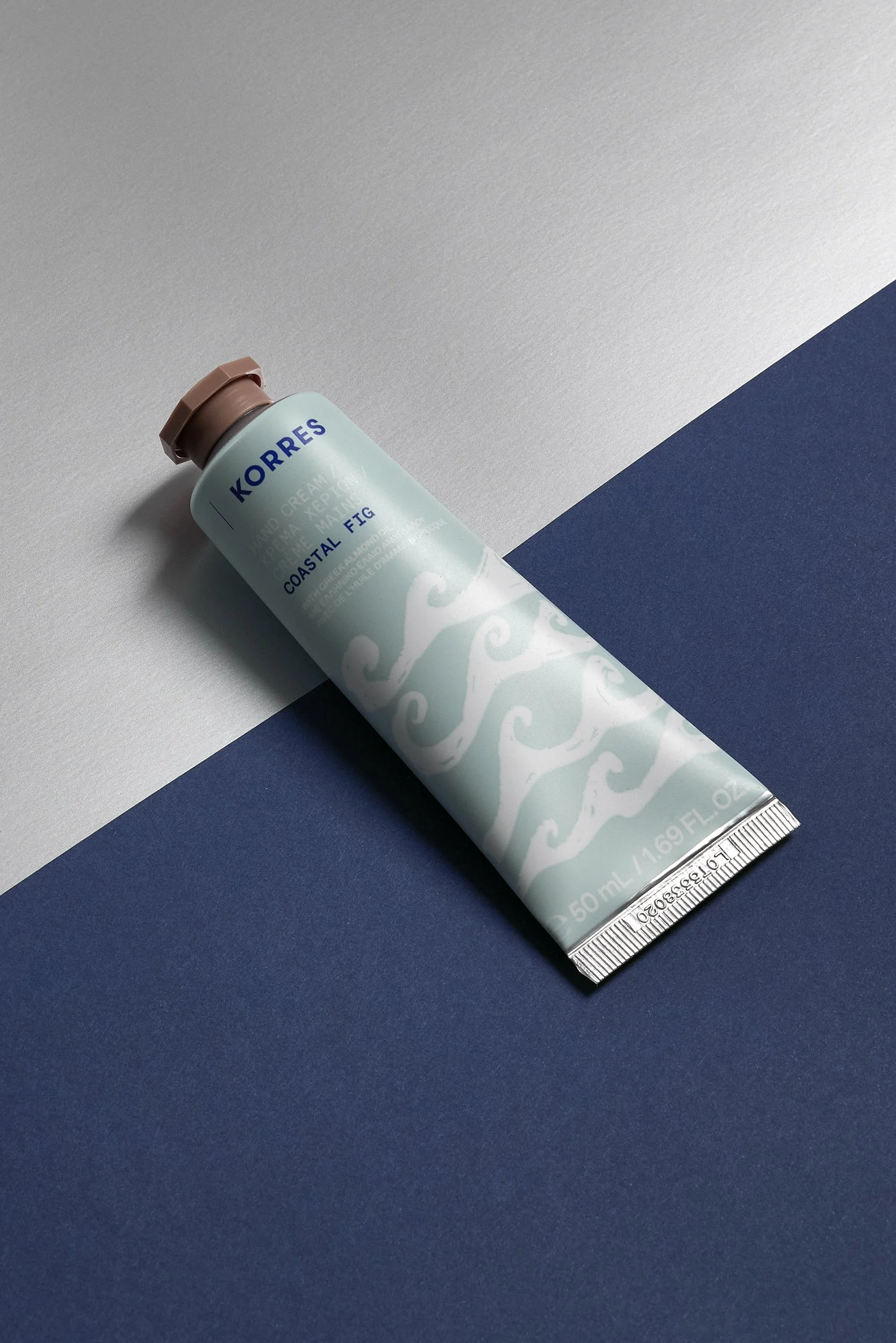
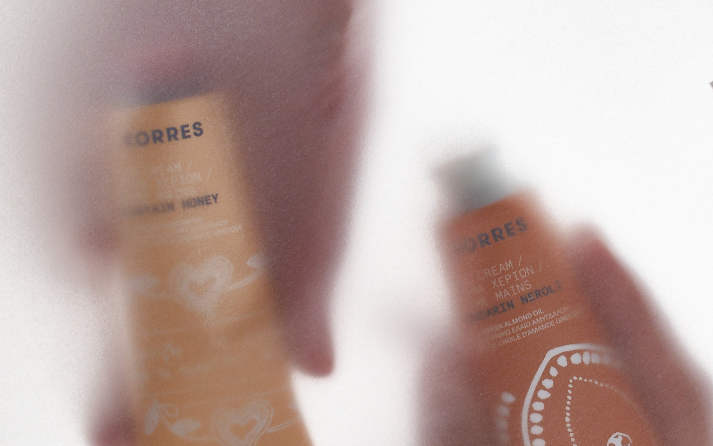
A bold, easy-to-grab packaging approach for an everyday essential, particularly relevant during winter. Starting from Greek folk references, traditional elements are used as the core visual language and reinterpreted through vibrant color and a monospaced typeface to create a contemporary look and feel.
Custom caps, matched to the color palette, are mixed across the tubes for a more playful result.

CLIENT: KORRES ART DIRECTION: Dimitris Papalois DESIGN: Dimitris Papalois PHOTOGRAPHY: Margarita Nikitaki, Panagiotis Baxevanis, Studio Pareidolia