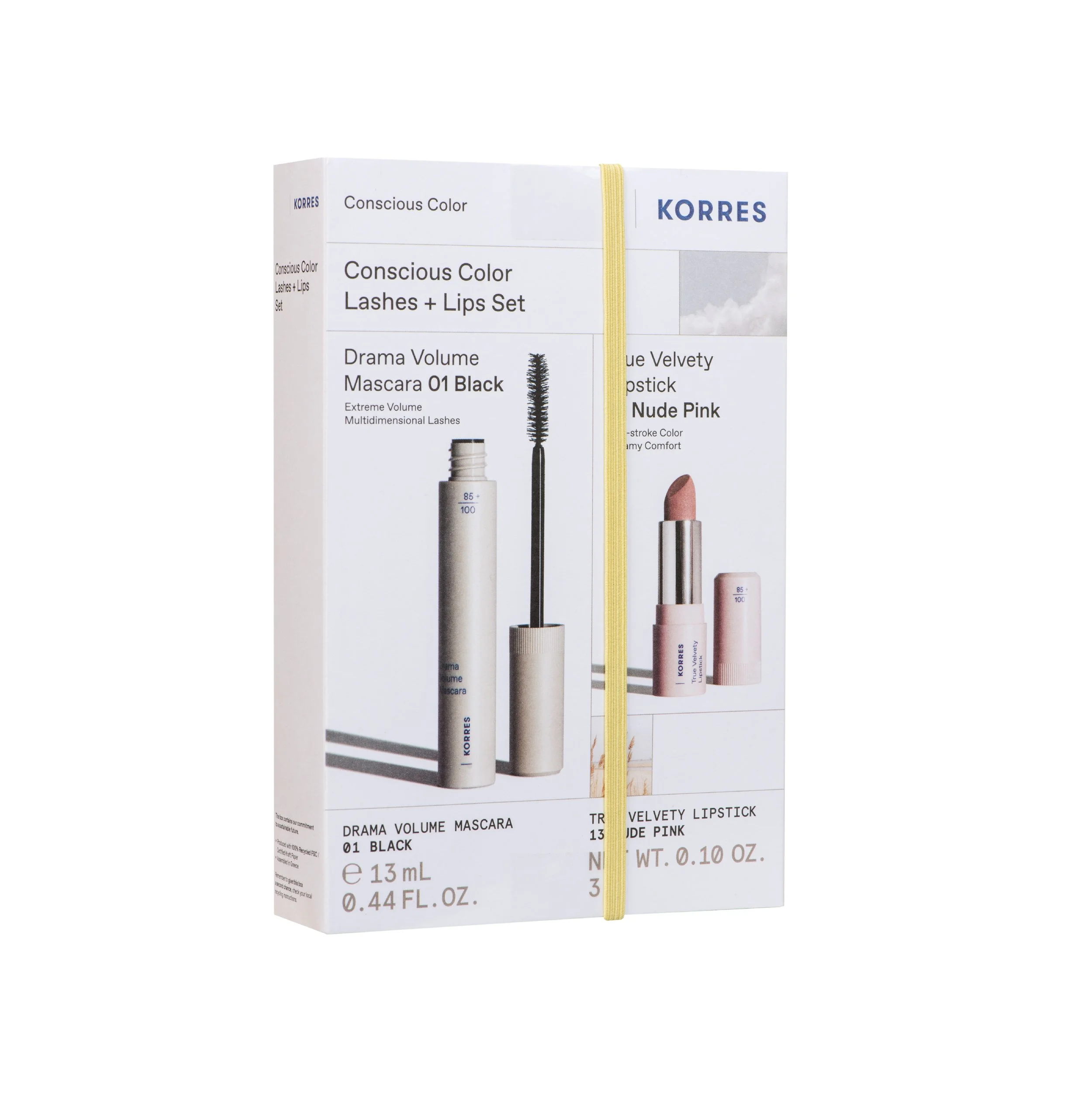
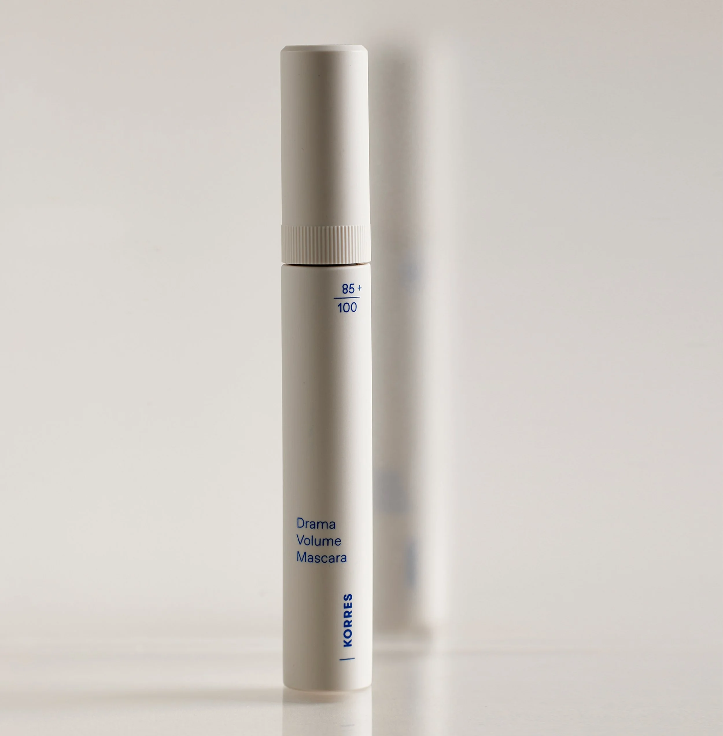
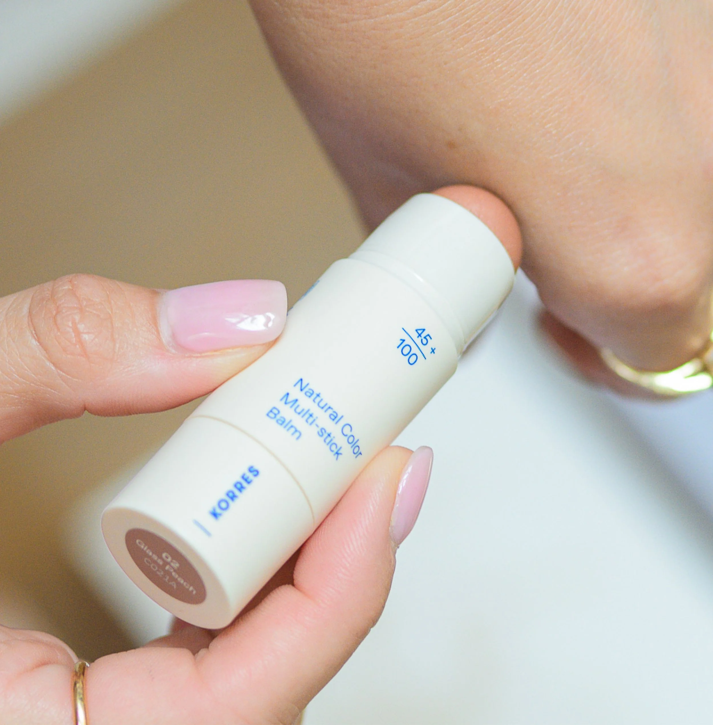
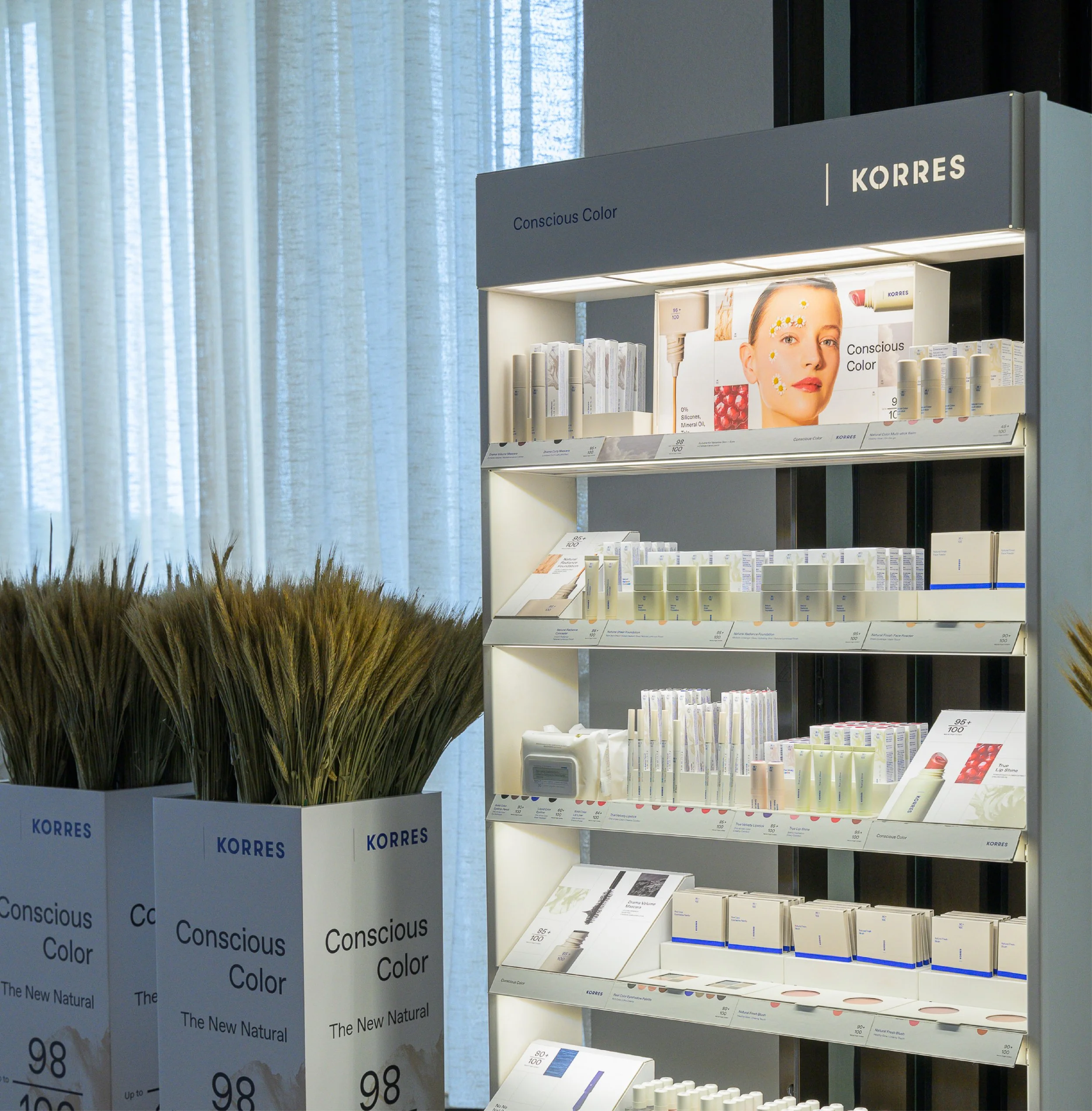
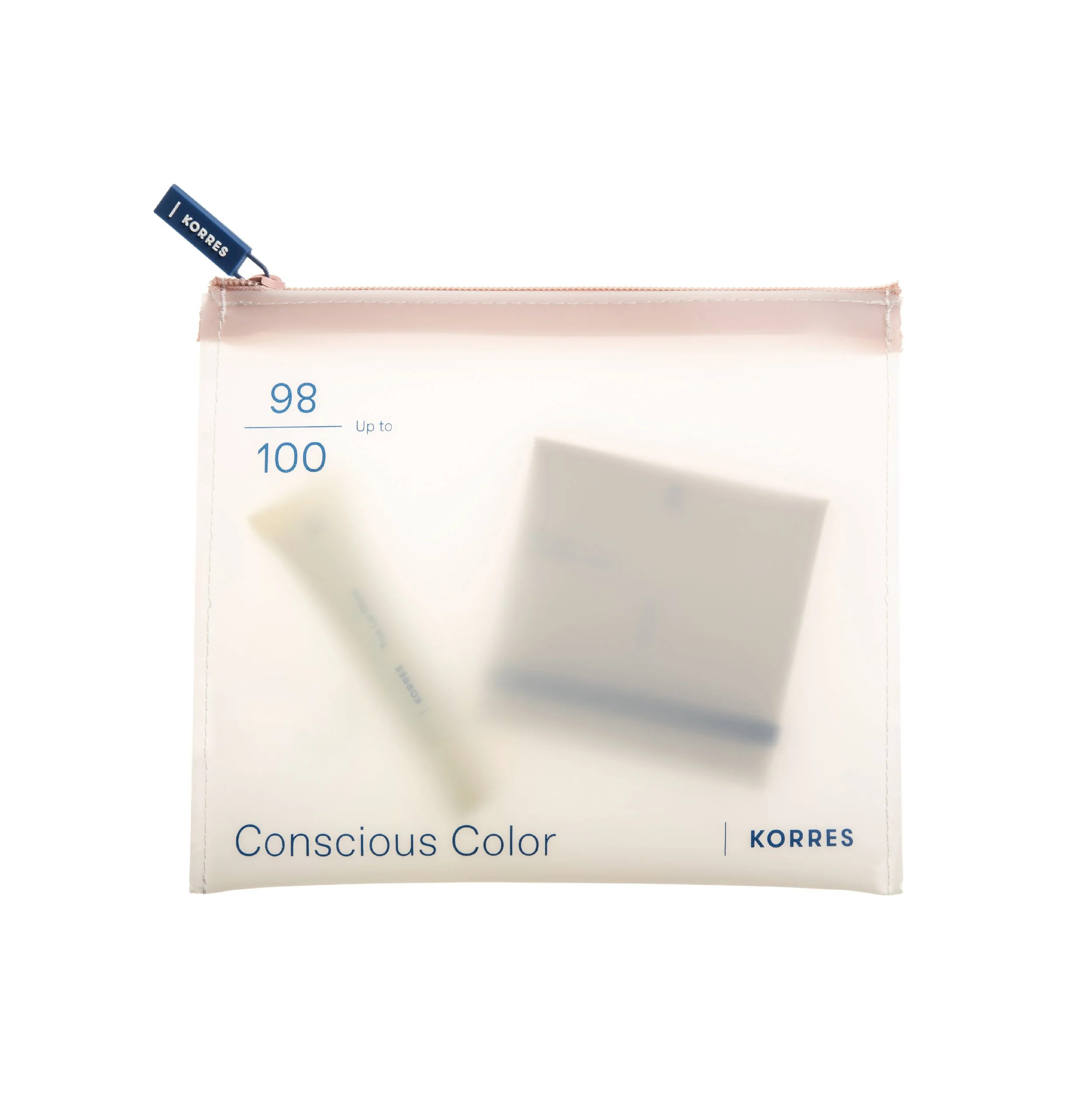
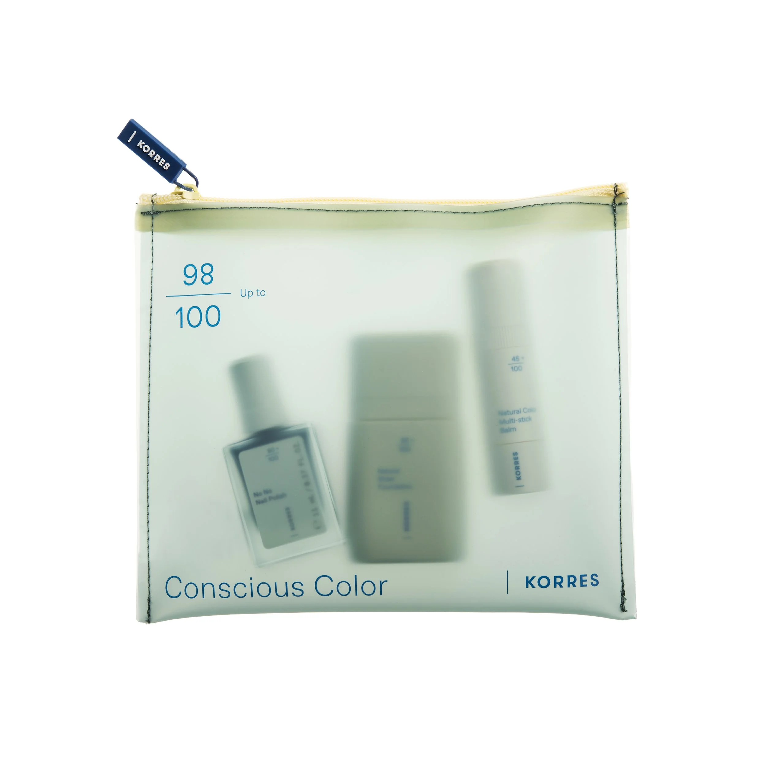
Conscious Color
Packaging Design for the Relaunch of KORRES Makeup
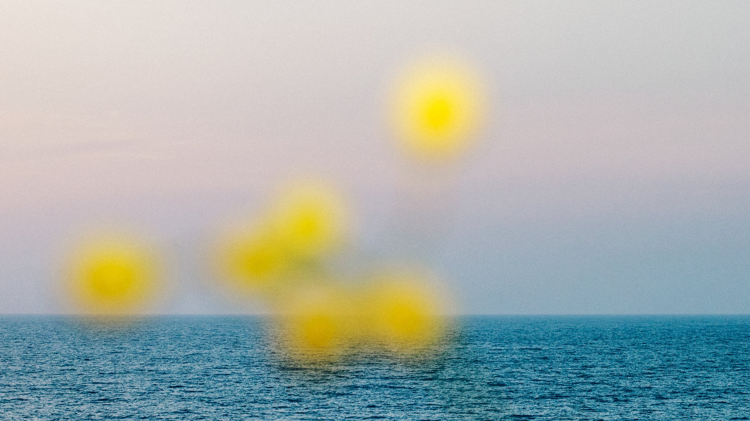
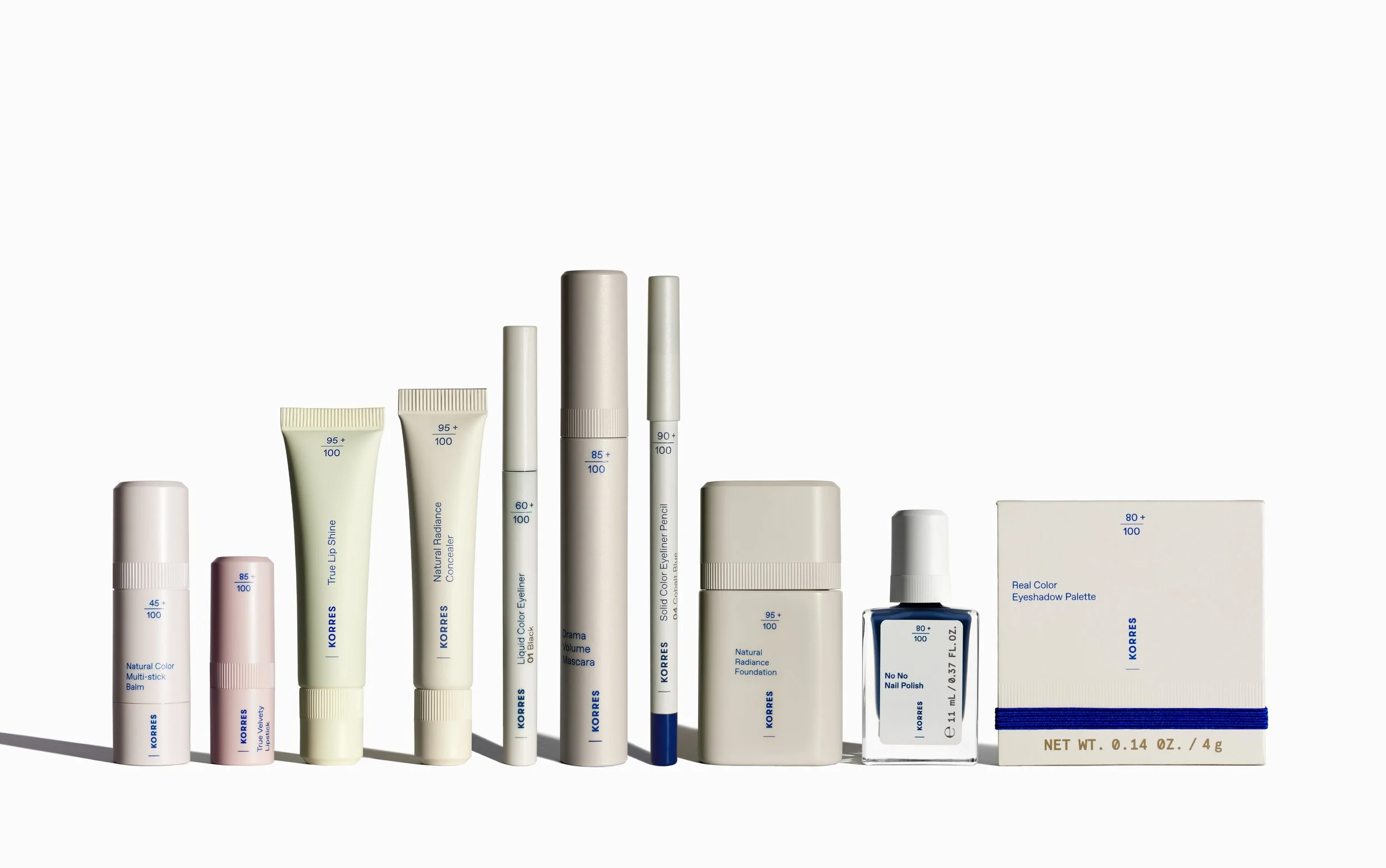
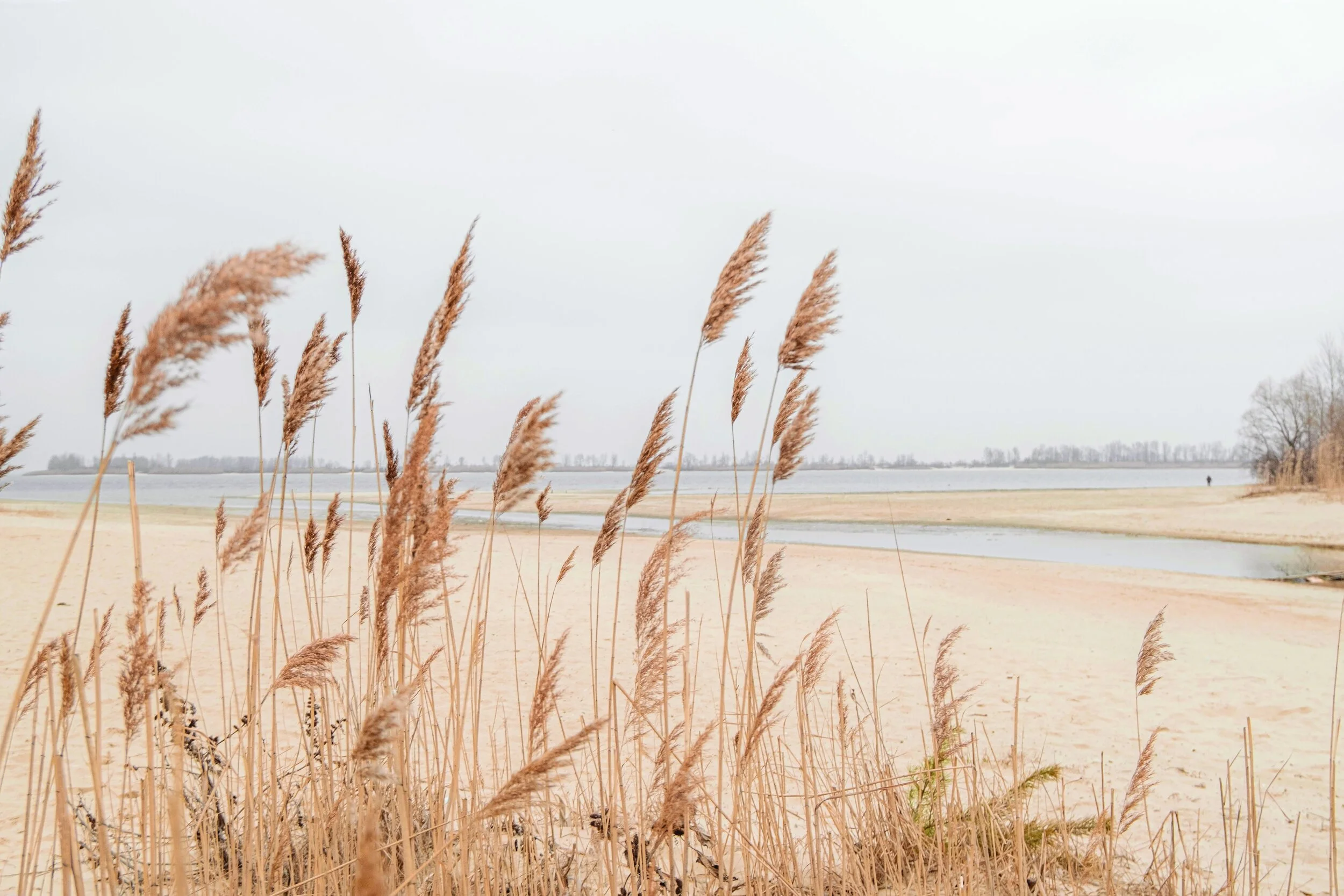
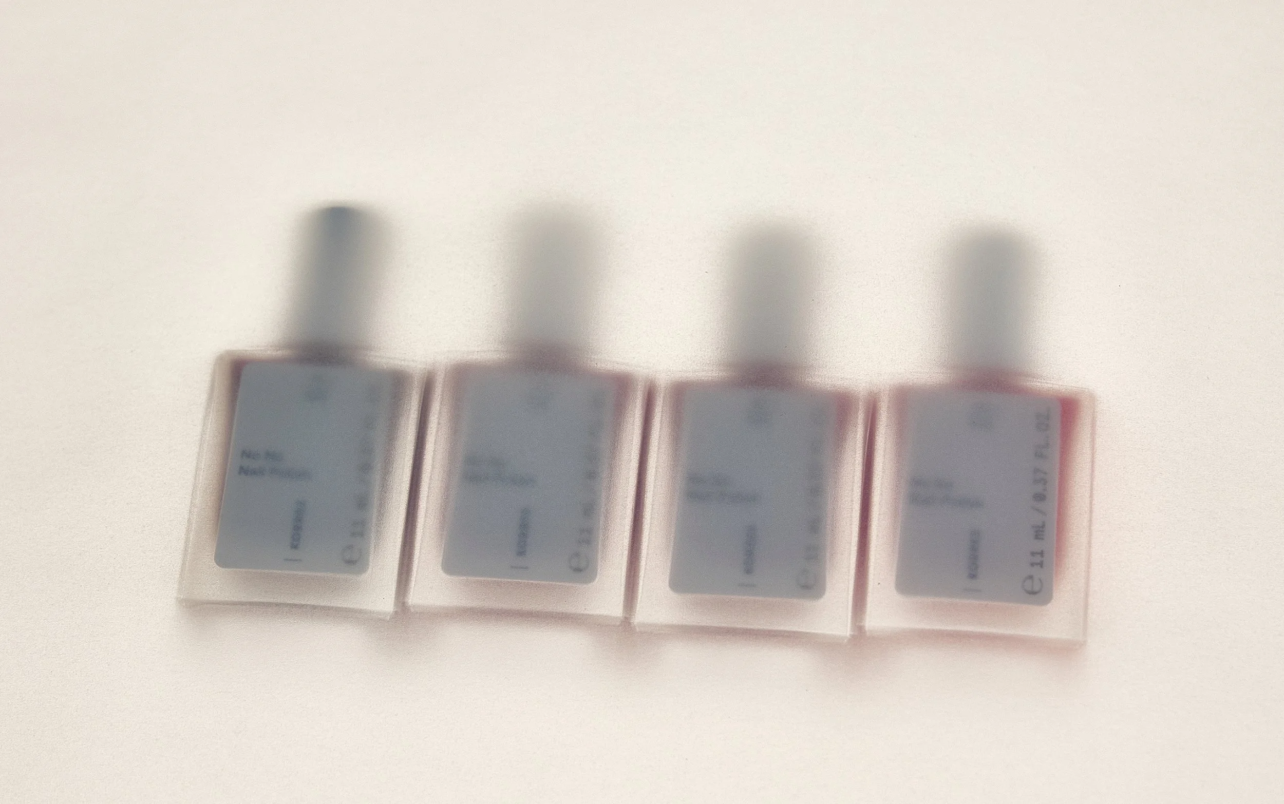
Visuals draw from the Greek landscape. Deep sea blues, sun-warmed neutrals, mineral beiges, and floral reds translate Mediterranean nature into a vibrant yet restrained makeup packaging system.
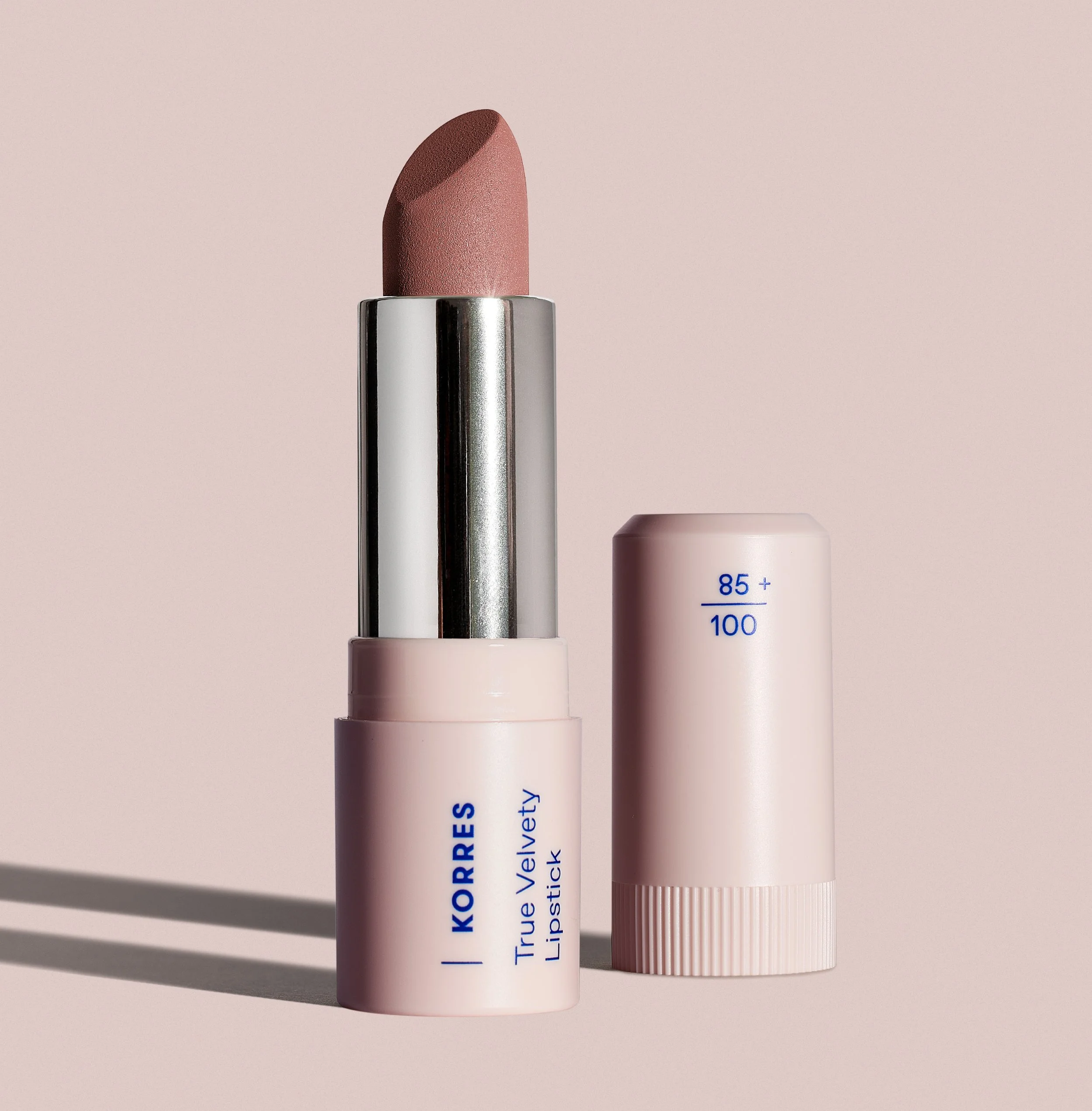
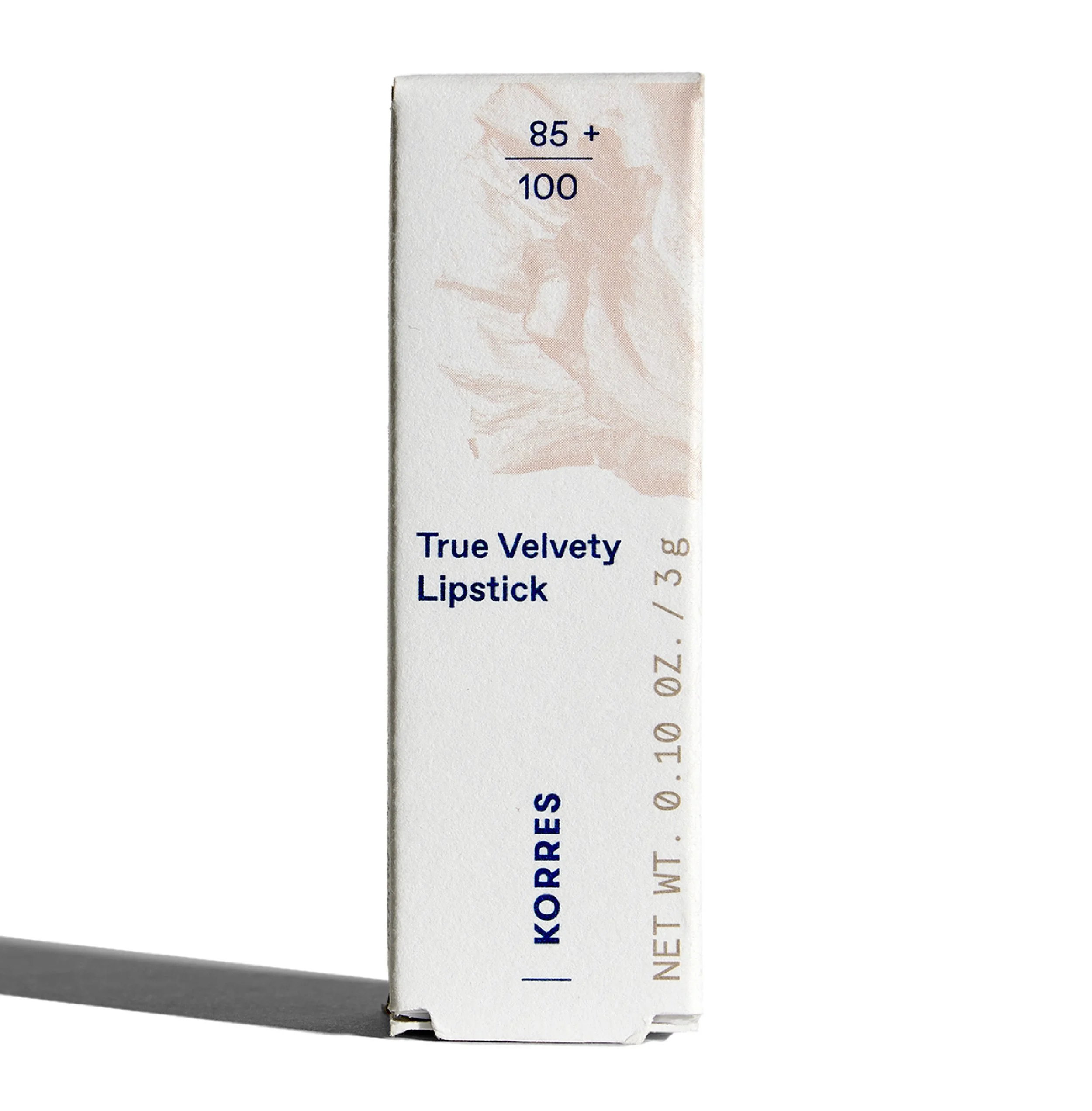
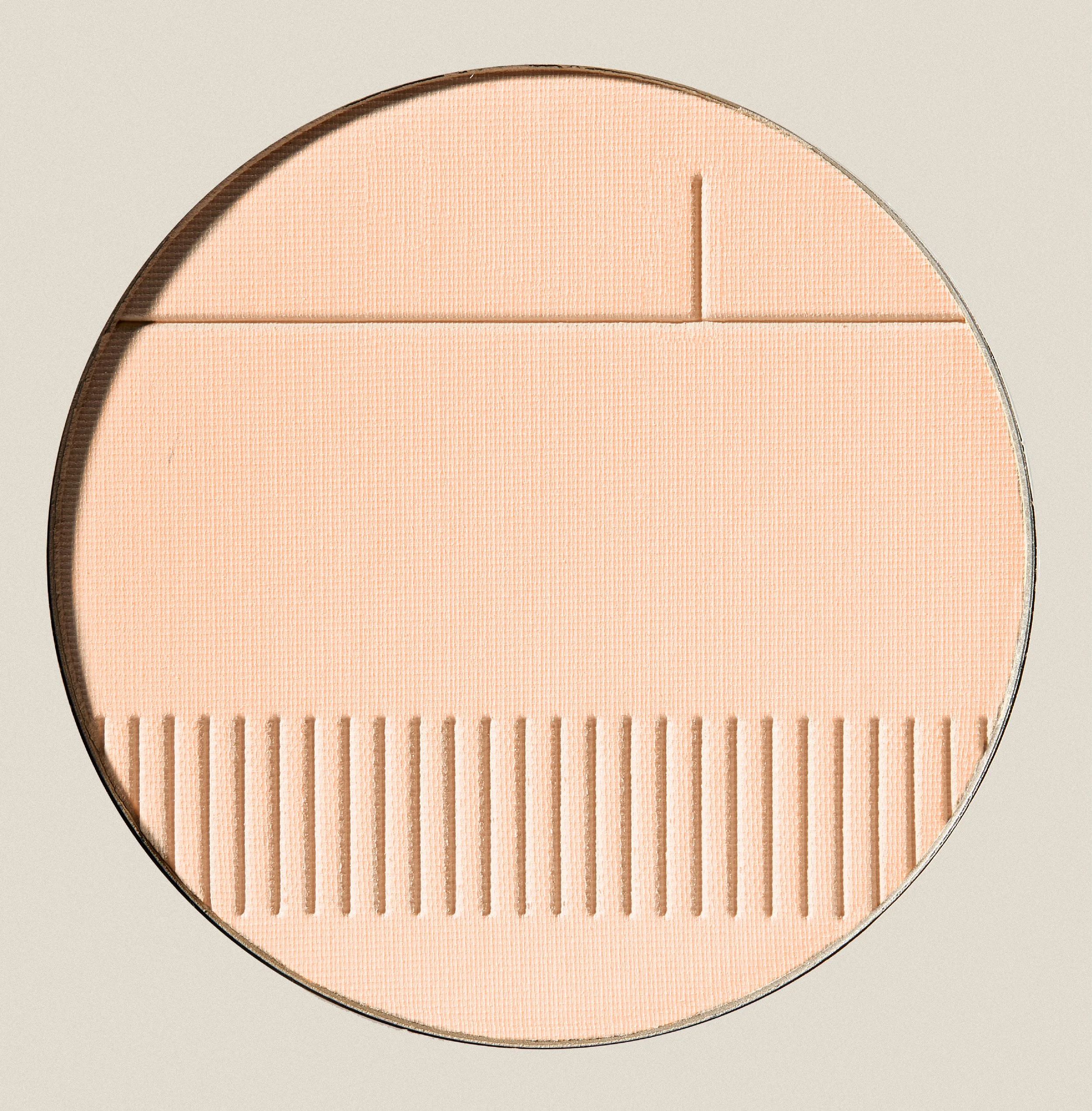
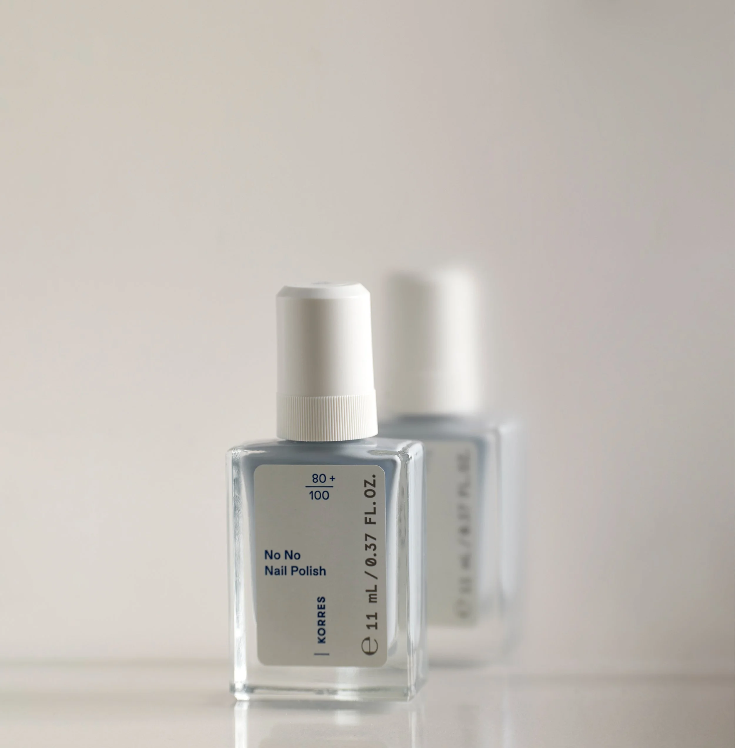
Soft pastel tones and subtle floral details highlight the brand’s clean formulas, while typography in KORRES’ iconic blue, anchors and unifies the system. The Natural Origin Fraction is elevated as a defining visual cue, turning transparency into a core design element.
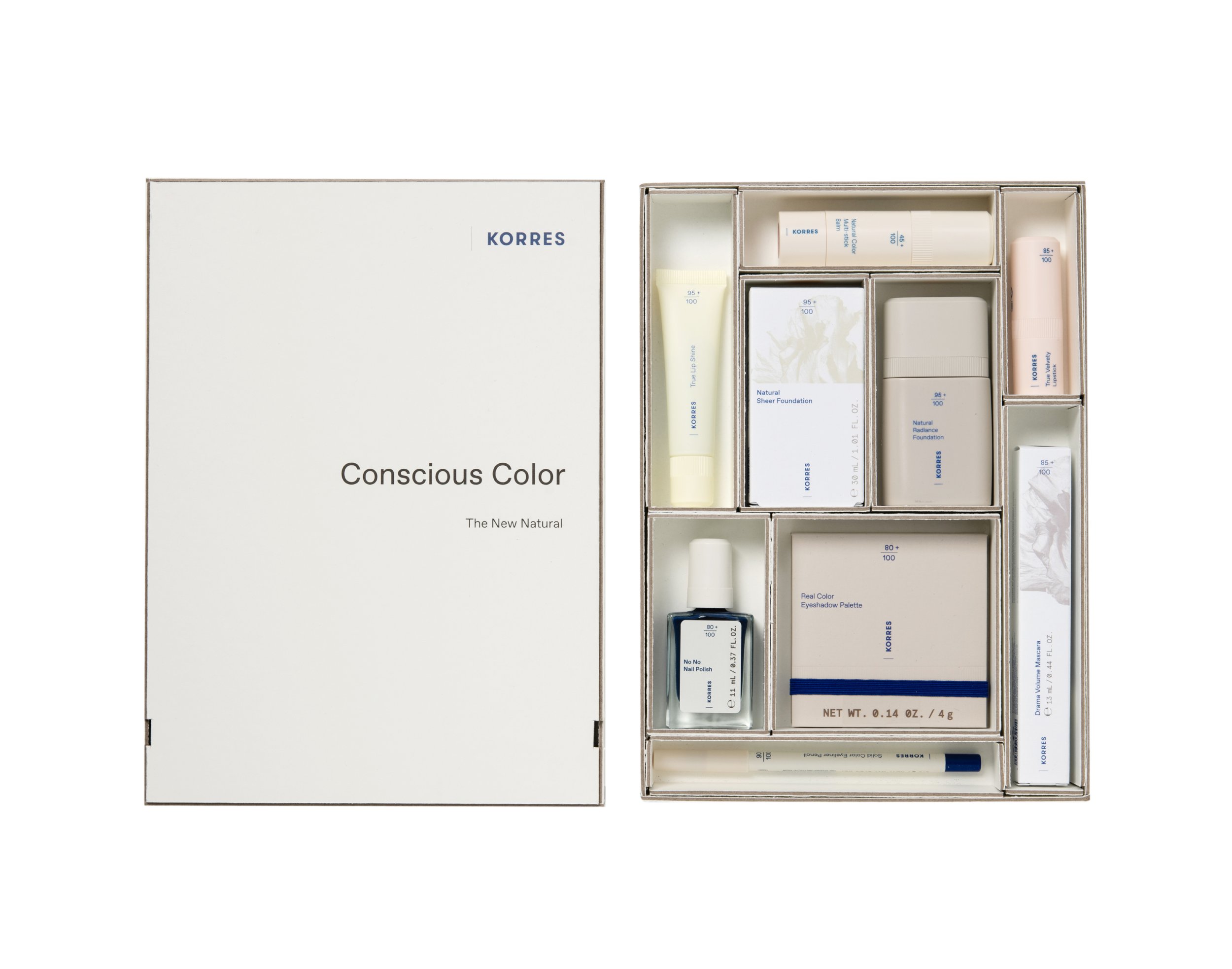
CLIENT: KORRES ART DIRECTION: Dimitris Papalois DESIGN: Dimitris Papalois PHOTOGRAPHY: Margarita Nikitaki, Panagiotis Baxevanis, Studio Pareidolia