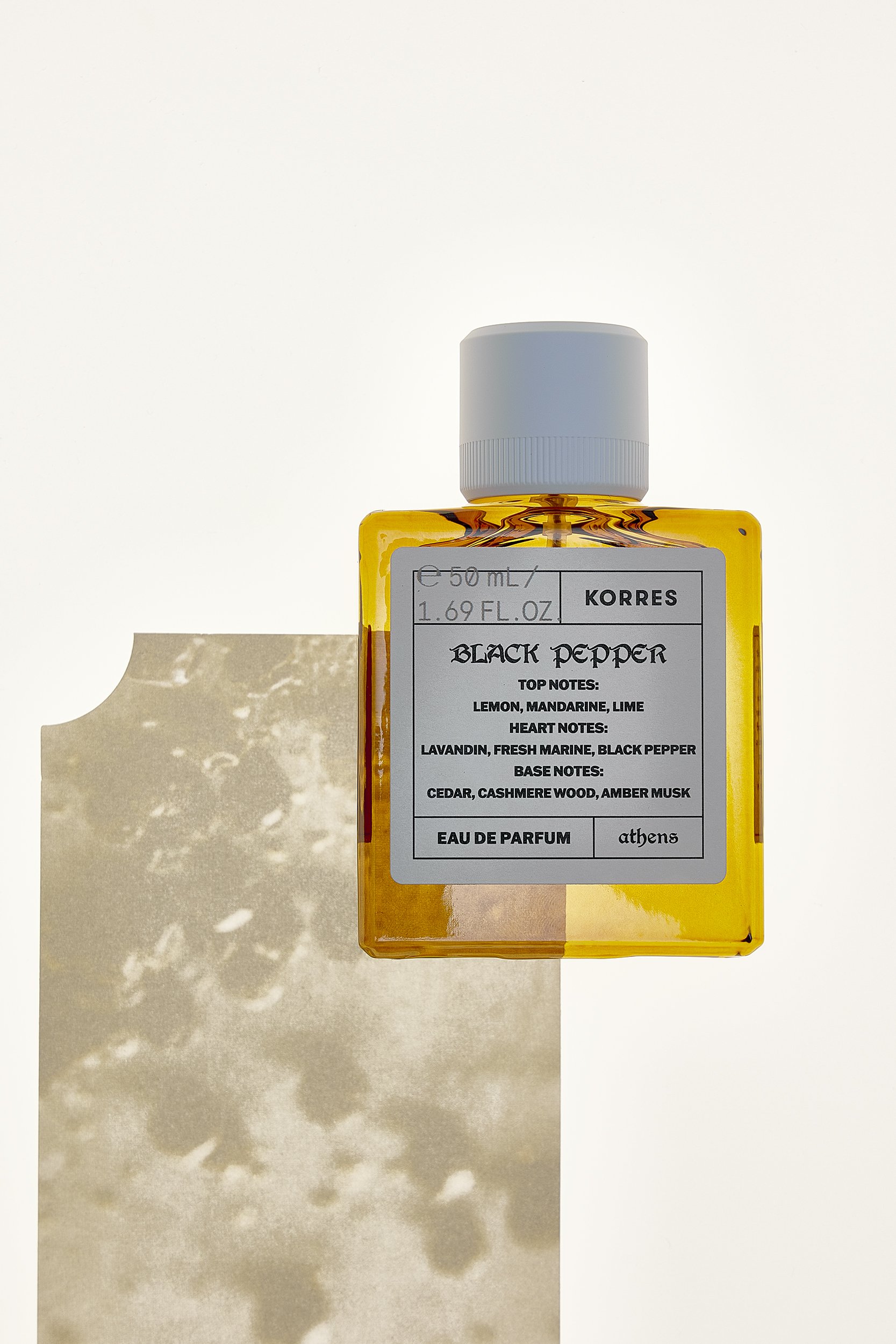
Eau De Parfum
Packaging Design for KORRES Premium Fragrances

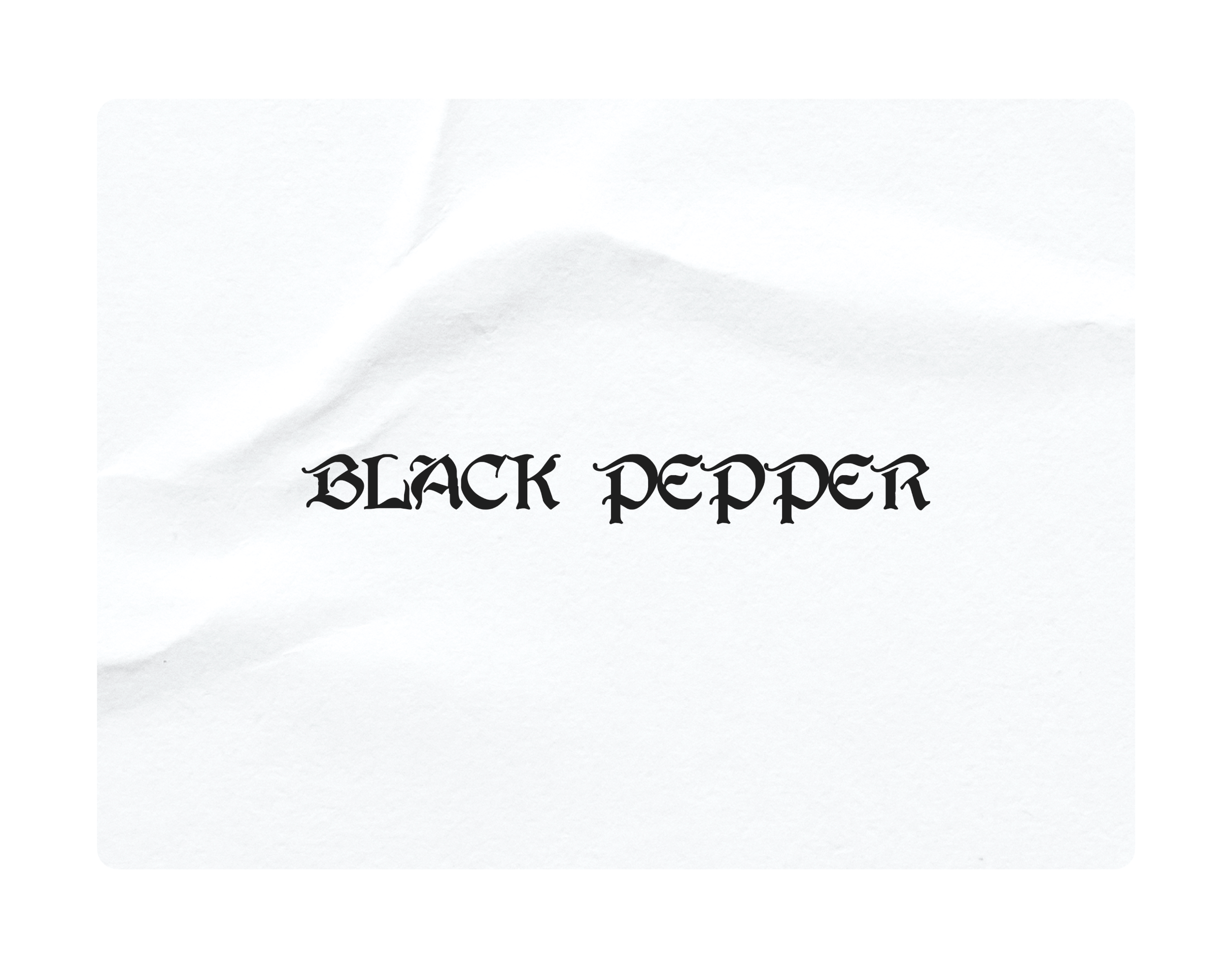
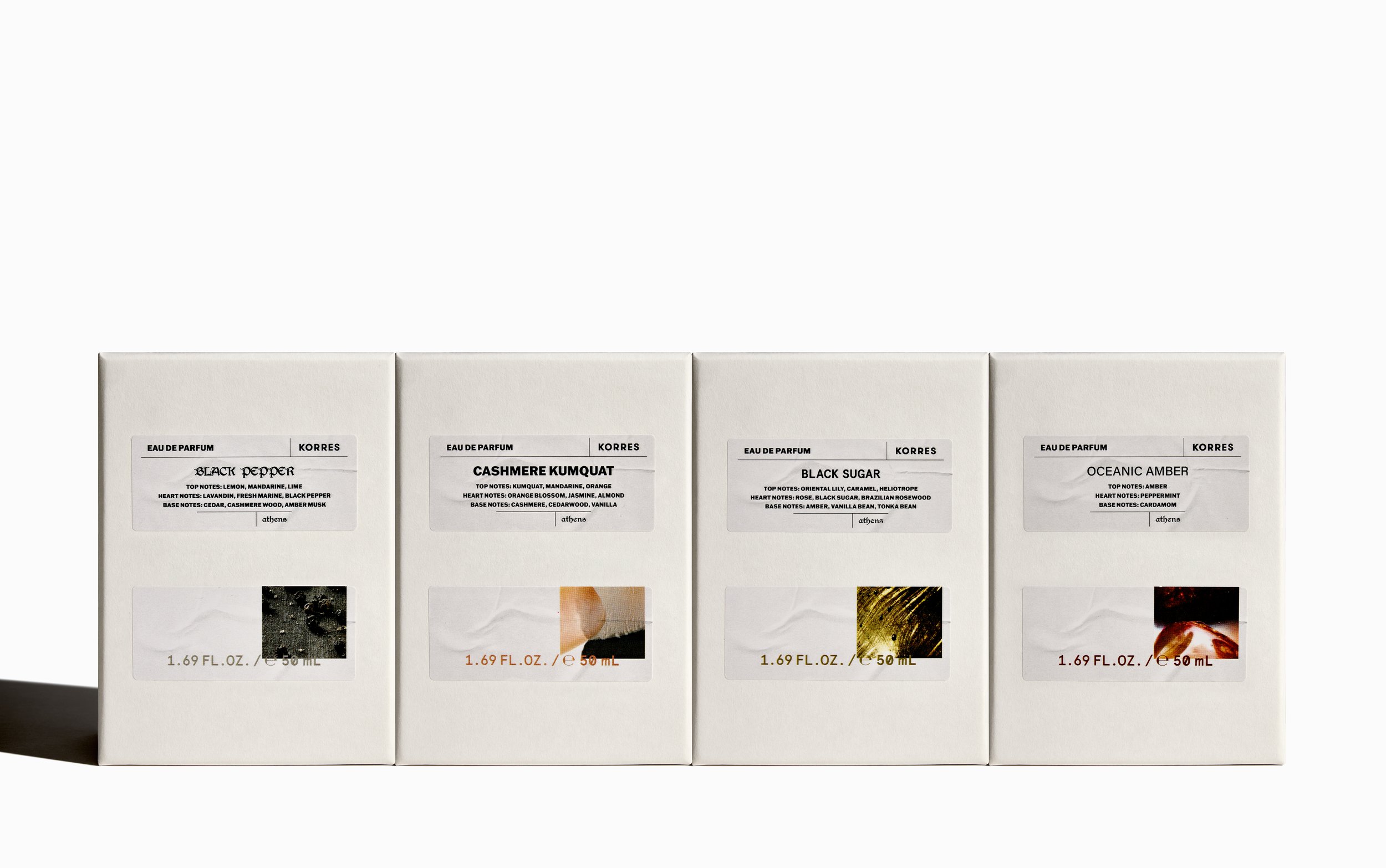
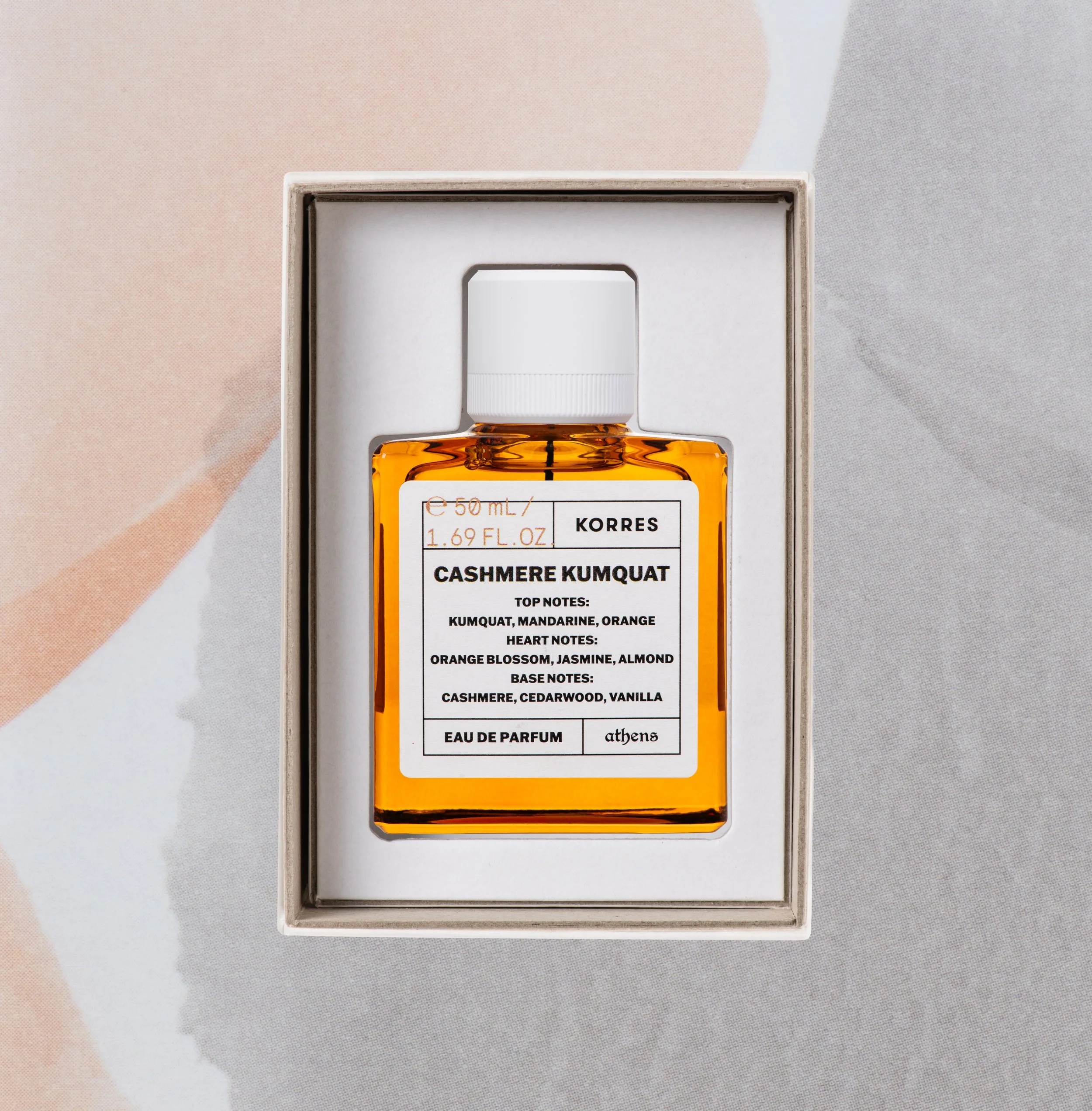
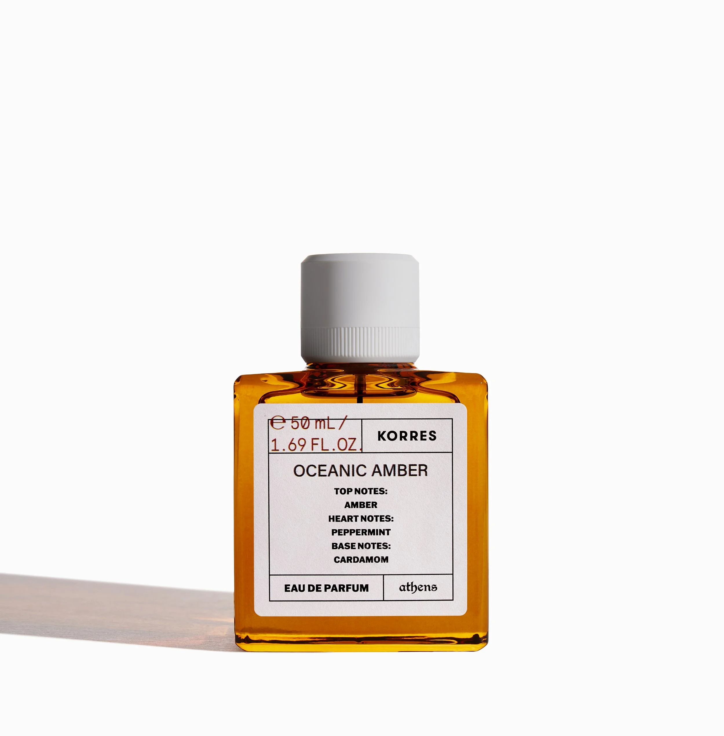
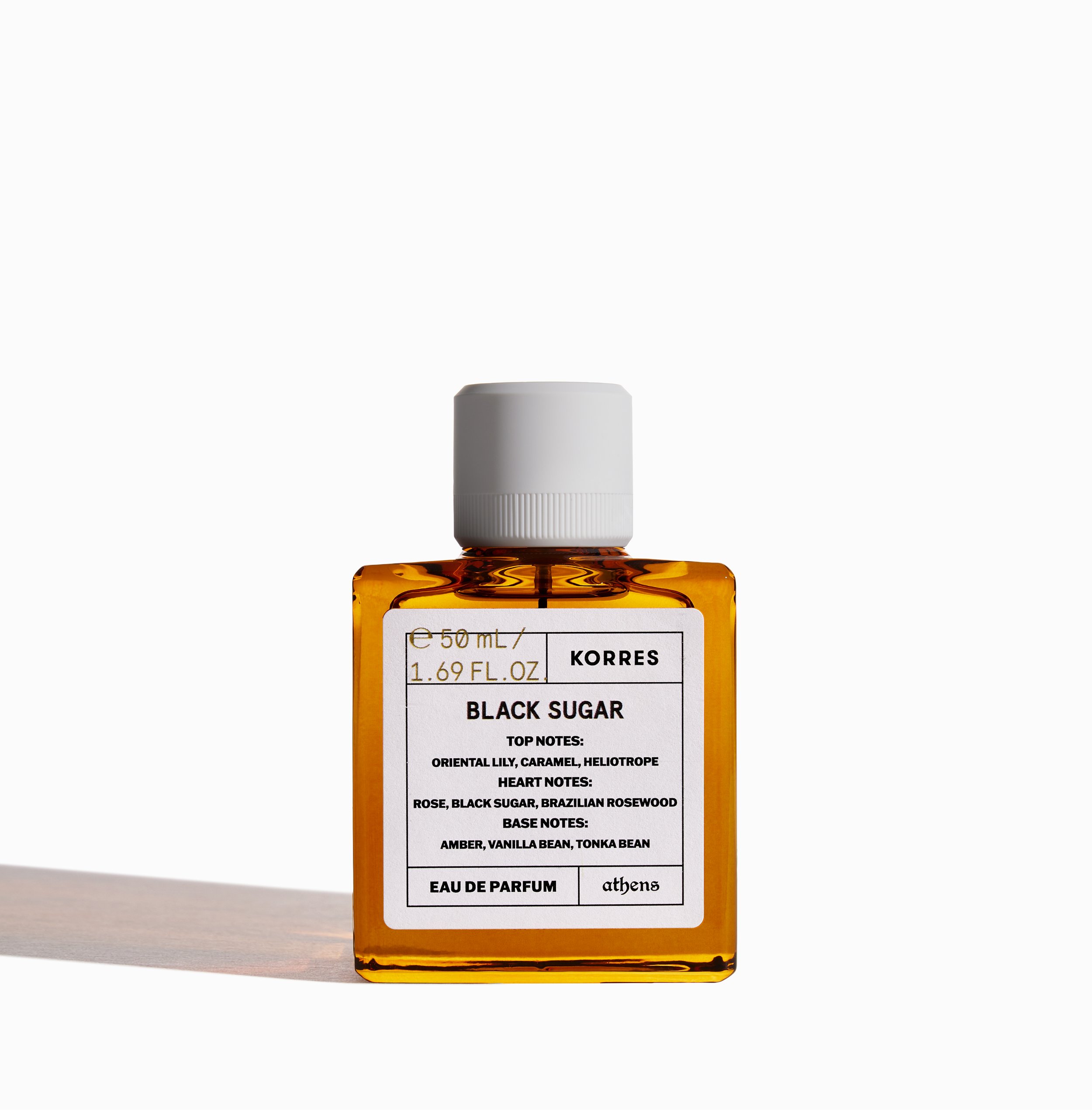
Using existing imagery from the Eau de Toilette series, the line is reworked into a more expressive direction. More experimental, bolder, and longer lasting. Different typefaces are selected for each scent, allowing typography to carry individual character and mood.
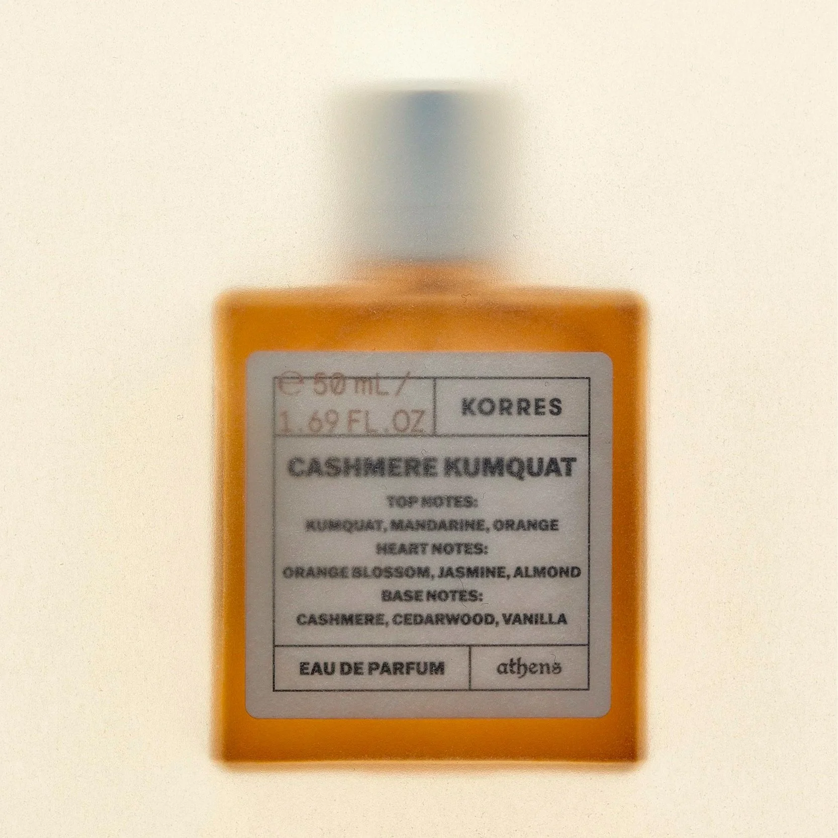
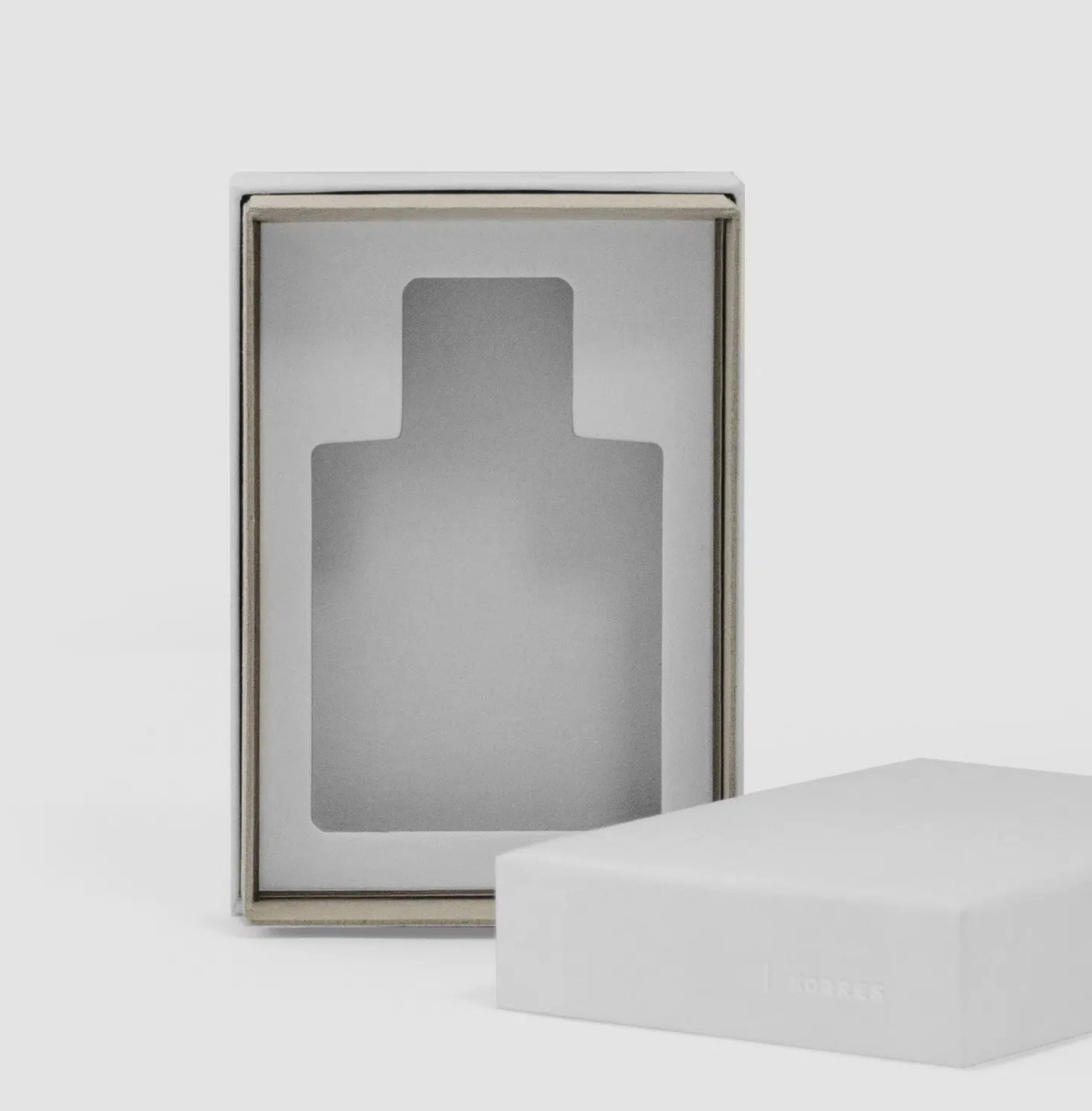
The outer box is constructed from chipboard laminated with white paper, designed to protect the bottle while presenting it as an object of value. Reflective labels introduce contrast, while a translucent printed inner sheet diffuses the visual intensity.

CLIENT: KORRES ART DIRECTION: Dimitris Papalois PHOTOGRAPHY: Margarita Nikitaki, Panagiotis Baxevanis, Studio Pareidolia